Daima Lala
Daima Lala
Redesigning packaging to call out from the shelf
Daima is one of the most renowned dairy & beverages brands in East Africa, known for its healthy & nutritious range of high-quality products that fuel the energetic urban African lifestyle.
But when it came to Maziwa Lala – the popular traditional, fermented milk Kenyan drink in their stables, competition analysis revealed that the current packaging was not standing out in the cluttered retail space. It was time for a packaging redesign with a difference.
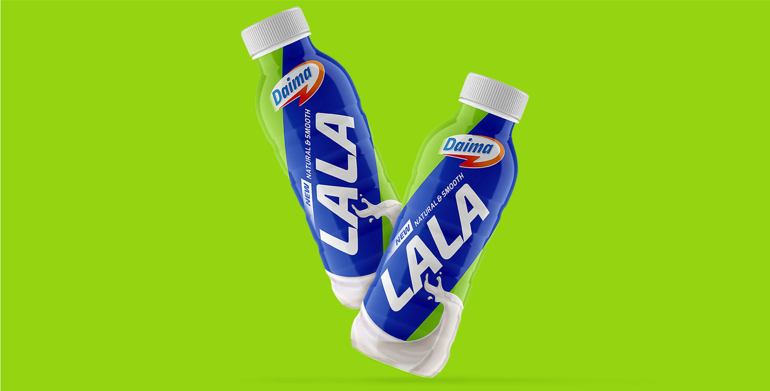
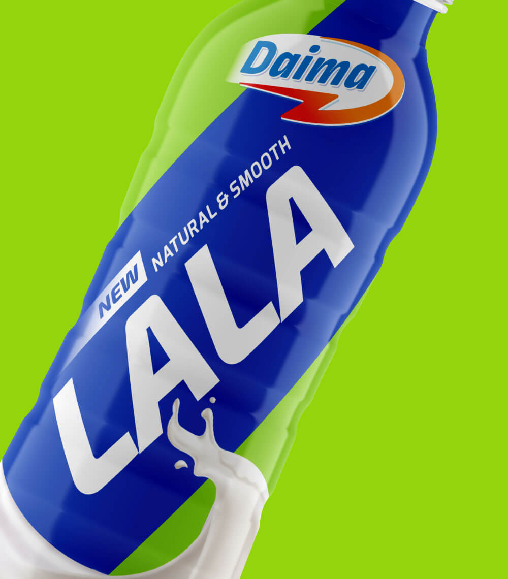
Our first step involved a full sleeve packaging instead of the current label packaging. This gave us a bigger canvas to play with. Daima is positioned as a fast, young & dynamic brand that fuels the tireless African lifestyle with a healthy and nutritious range of products. The next step we took in our quest to make the design minimalistic and inline with the brand positioning was to drop ‘Maziwa’ from ‘Maziwa Lala’ as it is commonly referred to as ‘Lala’ or ‘Mala’ in Africa. This made the brand sound both young & allowed ‘Lala’ to really stand out on the pack.
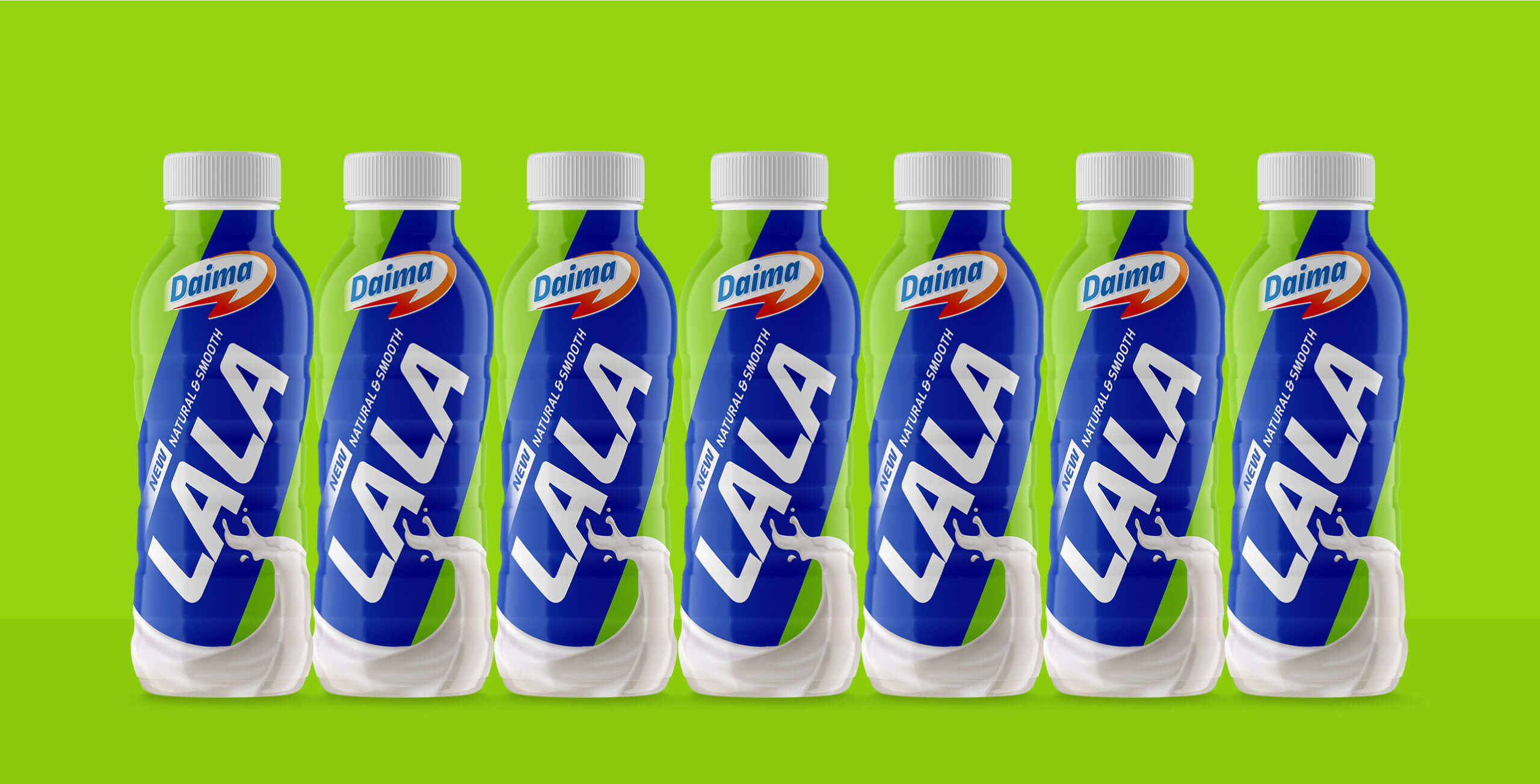
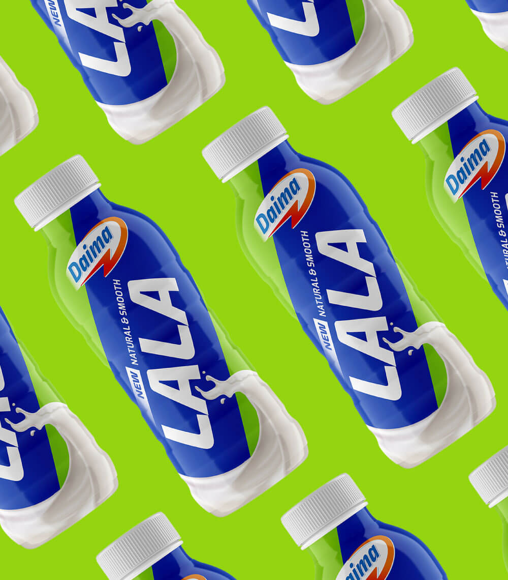
This simpler design and a much larger ‘Lala’ was in stark contrast with anything else on the shelves. The packs when stacked together, formed a unique and stark graphic pattern too. The new design catered to changing consumer trends and made Daima Lala one the most visible brands on the shelf. Talking, communicating and charming shoppers like never before.
- Expertise
- Packaging Redesign
- Visual Language


