Goodness Farm
Goodness Farm
Transforming a local Russian dairy
Russia based Cherepovets Dairy Plant was going through their biggest rebranding exercise and Plus One was appointed for the same.
How do you rebrand a historic dairy plant, change brand perception and increase market share in a saturated Russian dairy market dominated by both well established big brands & several local players?
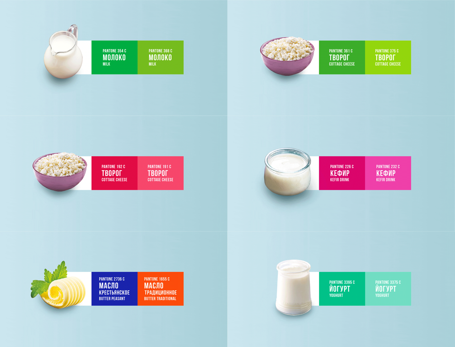
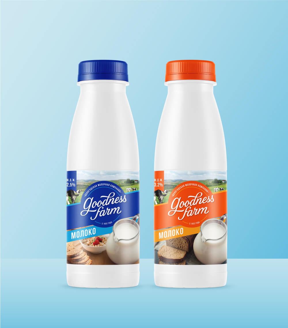
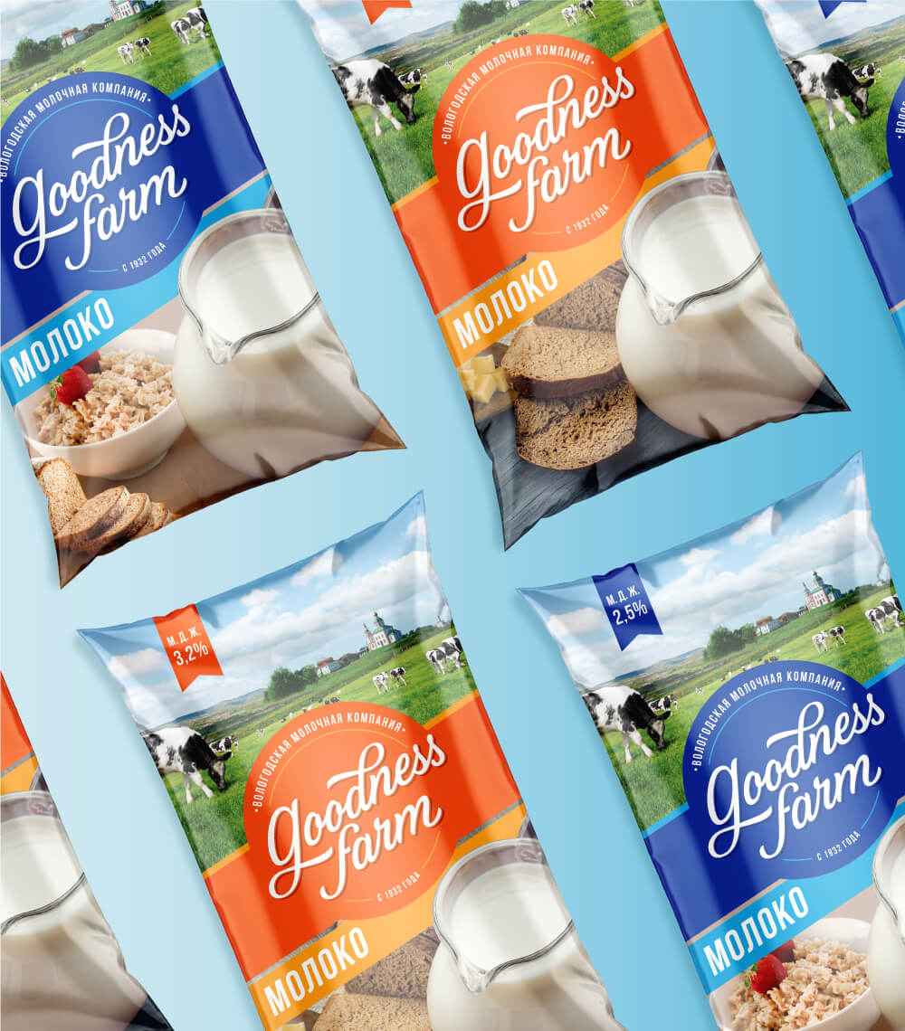
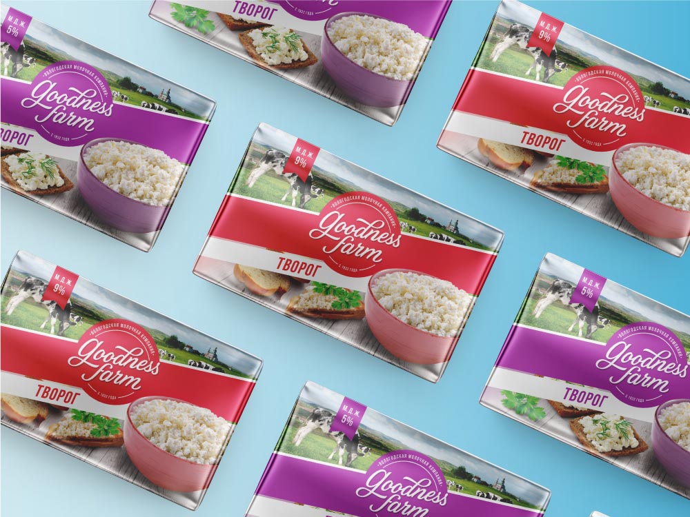
Cherepovets Dairy Plant products were not sold under any particular brand name but were endorsed by the dairy. Each product was sold under category descriptor name making each product category look very different from another. With a vast 8+ product categories and 35+ SKUs this meant a lack in brand consistency.
Despite the above, Cherepovets Dairy products were know by the local community for its sheer quality and history. The Cherepovets Dairy Plant was founded back in 1932. The production of dairy products of the enterprise is based on the primordial Russian traditions of the Vologda dairy business. They do not use artificial additives in production, therefore all products of the Cherepovets Dairy Plant are not only nutritious, but also beneficial to health.
In a market where farm fresh to supermarket was the common story told by most brands and adjectives like natural, fresh and pure were commonly being used, we had to dig deeper to find a true, unique story.
So we started with the very origin of our milk. Cherepovets Dairy Plant is located in Cherepovets district, part of the Vologda. The region is blessed by the rich Volga river, known as Mother Volga in Russian folklore. The local water meadows, where the cattle graze, are considered the best in the country because of the soft misty summer, favourable for the growth of forage plants. It is naturally good.
The incredible history of the Volga in Russia, makes it good. Cherepovets also has local heritage and legacy of providing milk in the region. People have strong associations of growing up drinking this milk. The memories make it good.
With the goodness of nature, childhood memories filled with wonder, discovery, freedom and purity of life on a farm, in a village, in the lap of nature we aptly named the brand ‘Goodness Farm’.
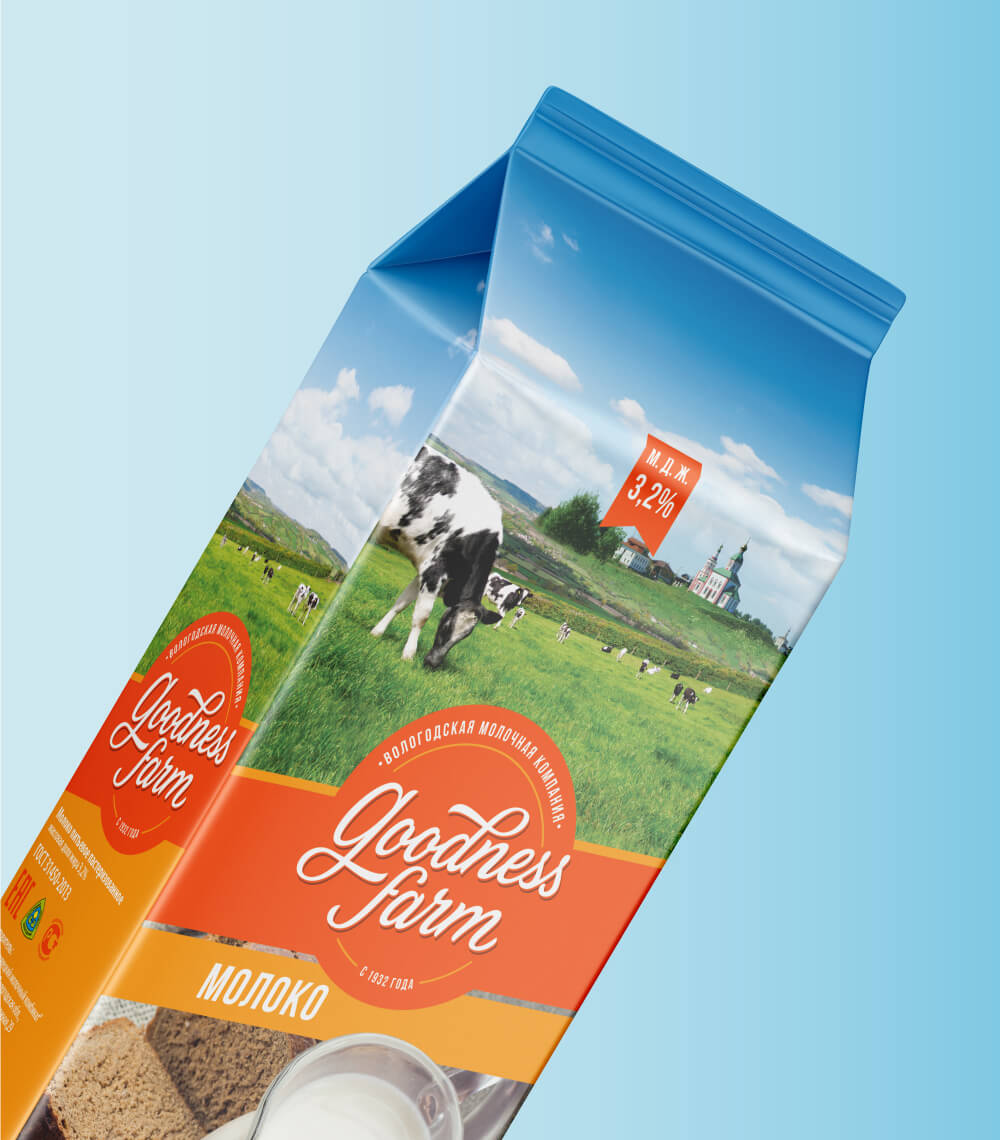
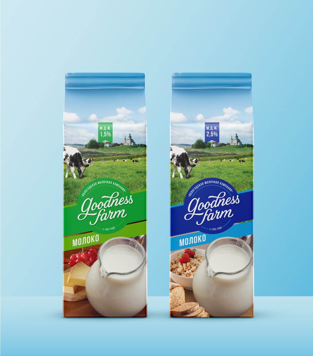
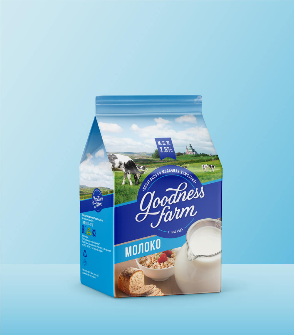
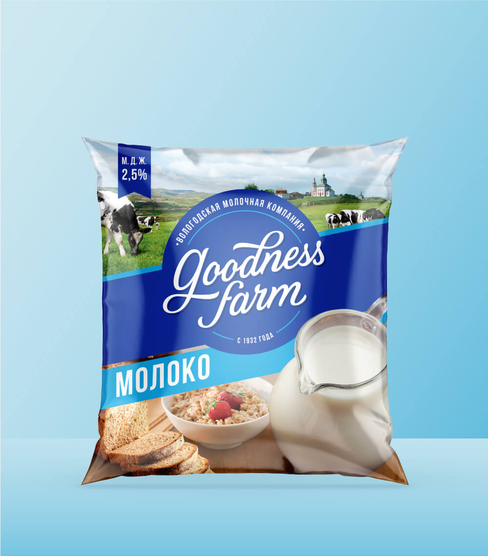
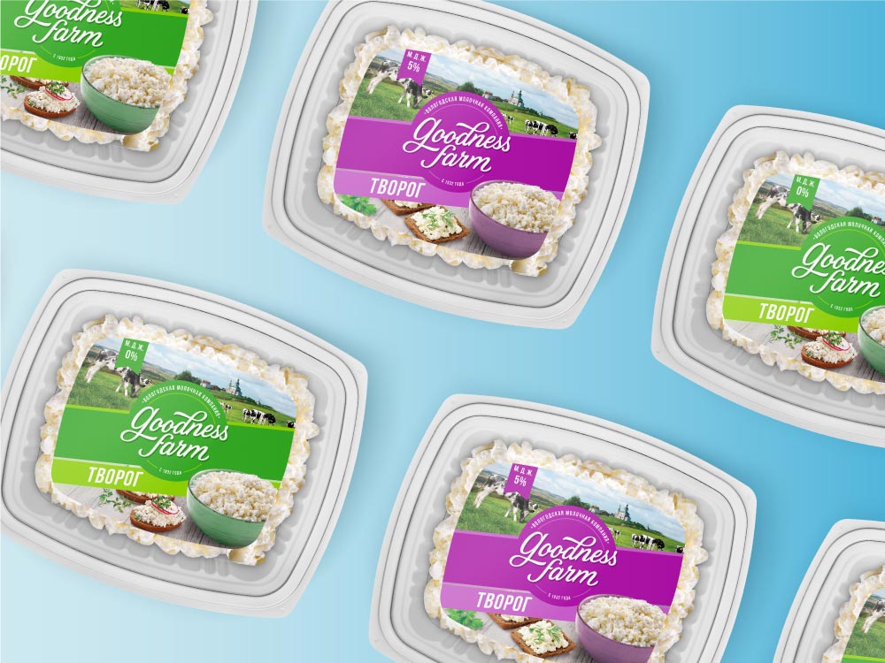
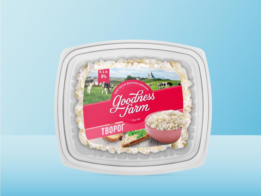
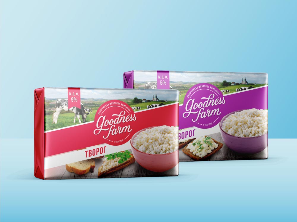
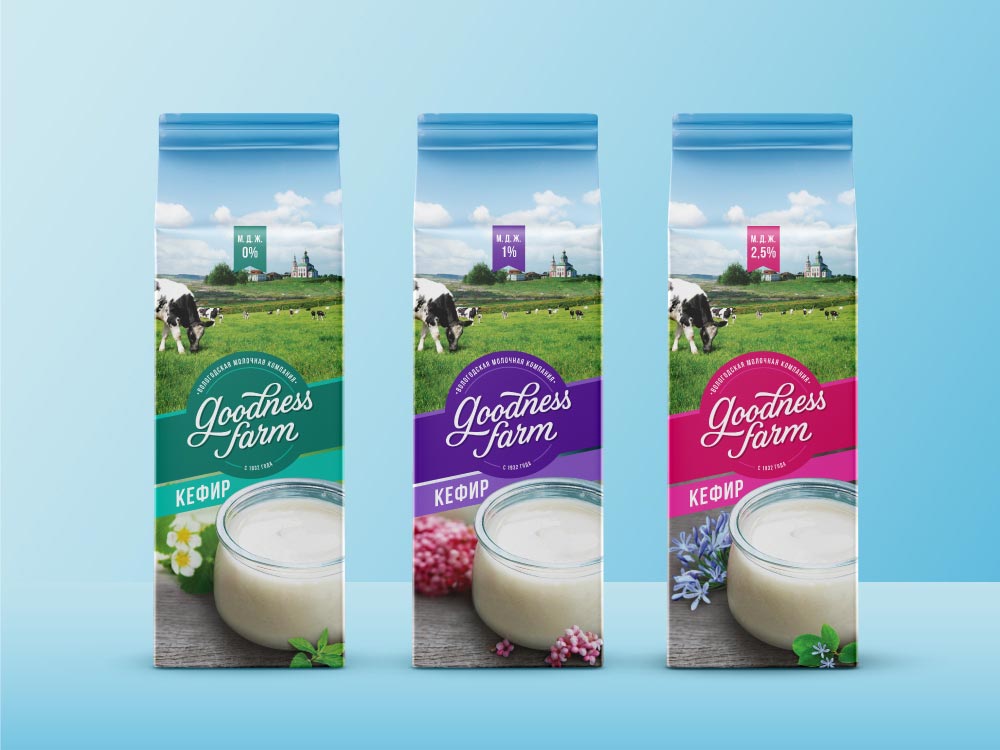
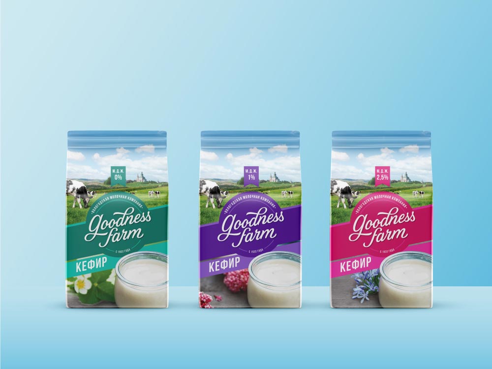
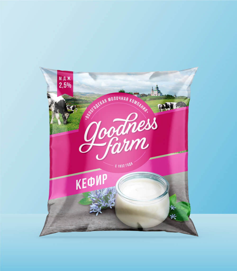
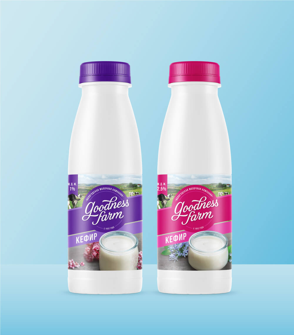
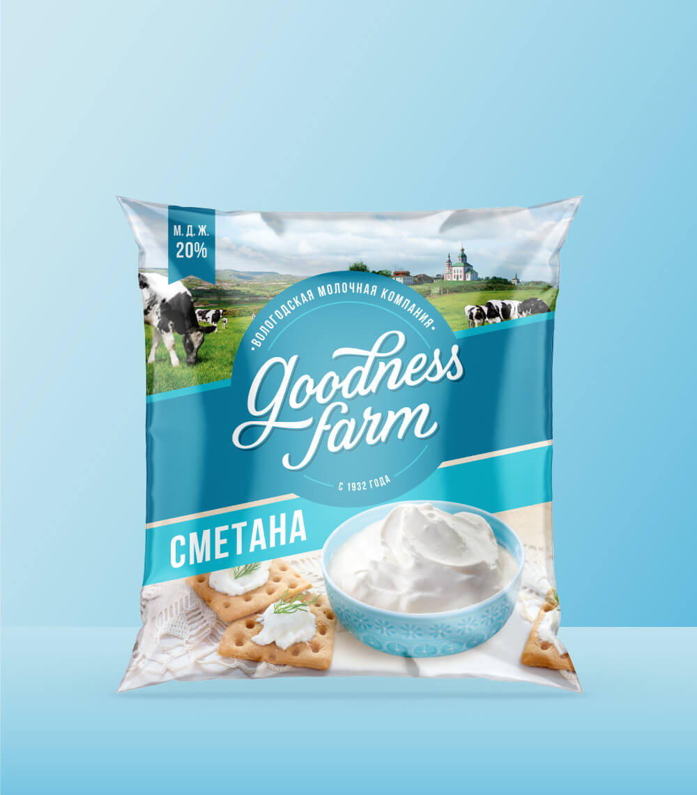
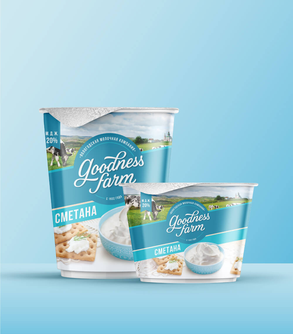
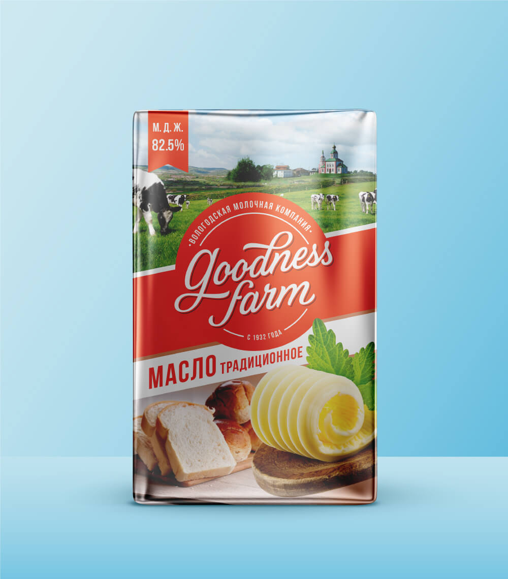
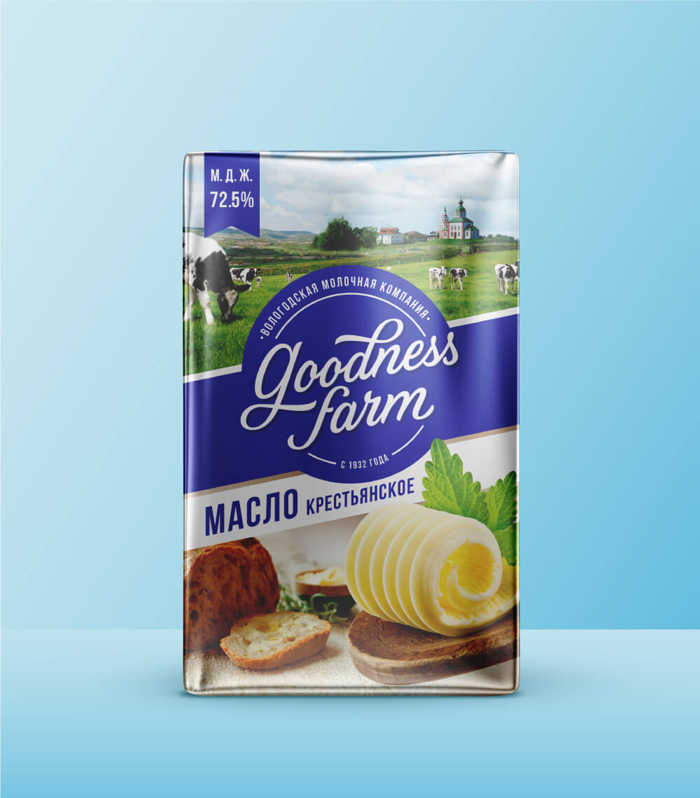
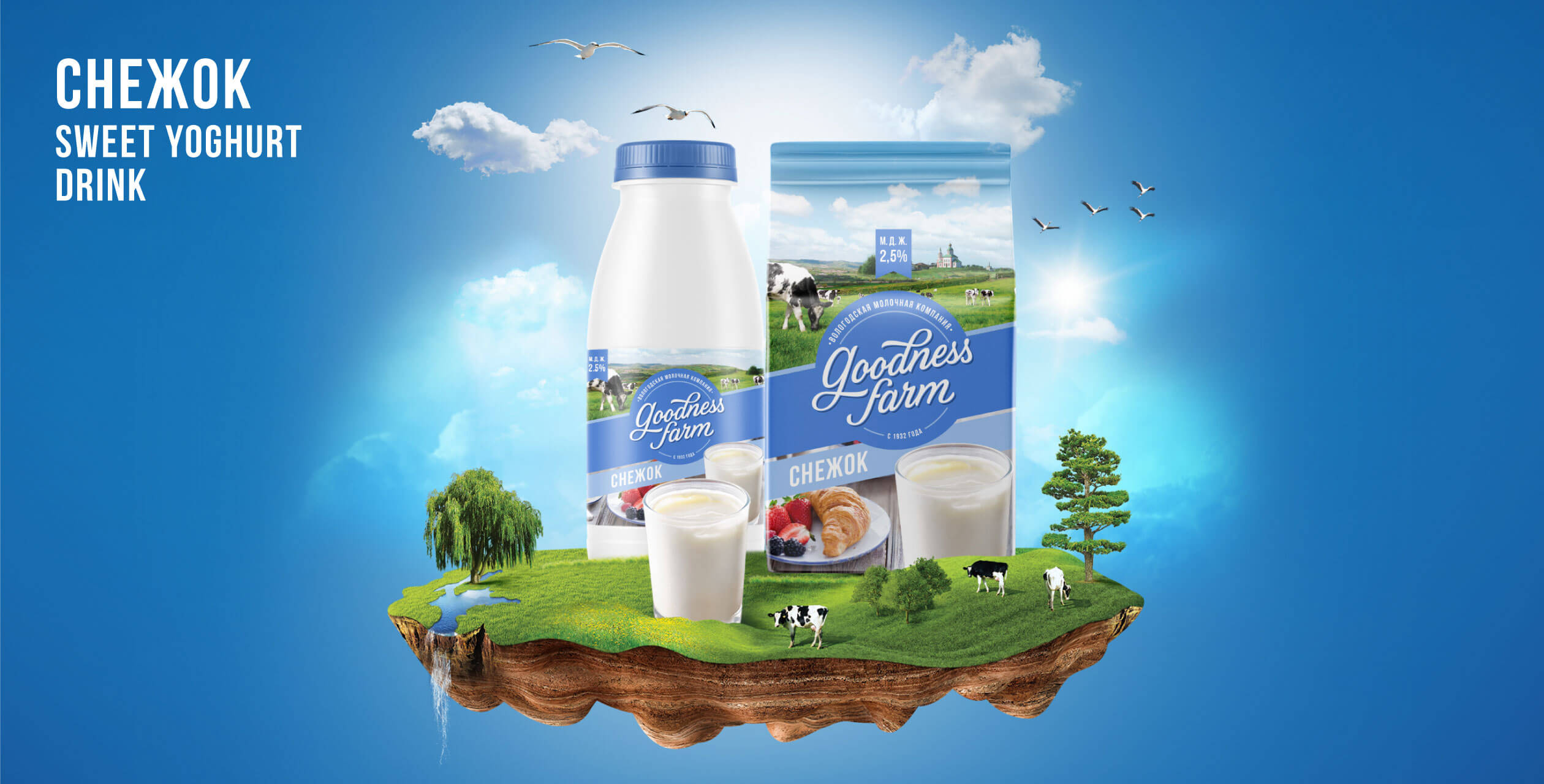
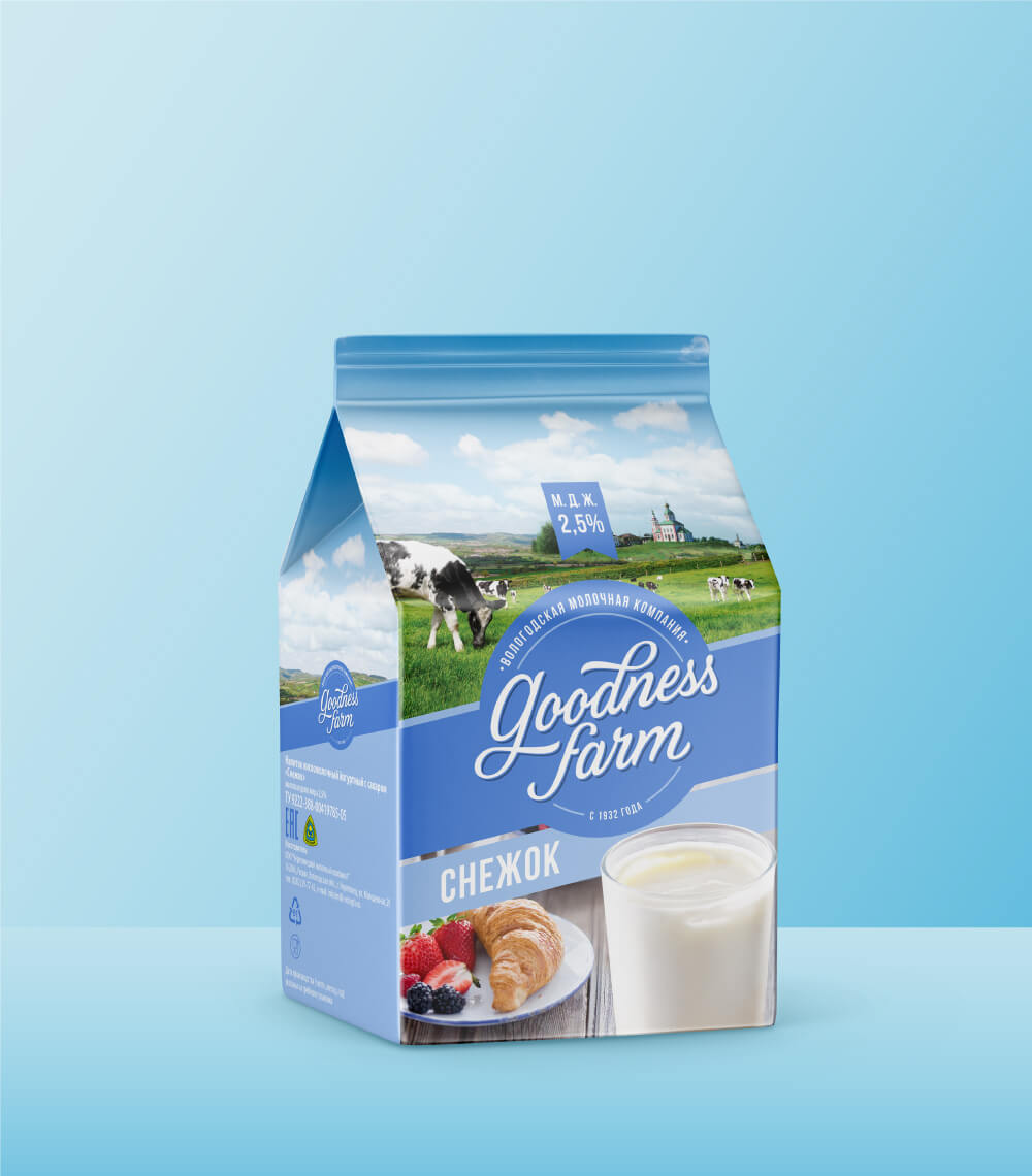
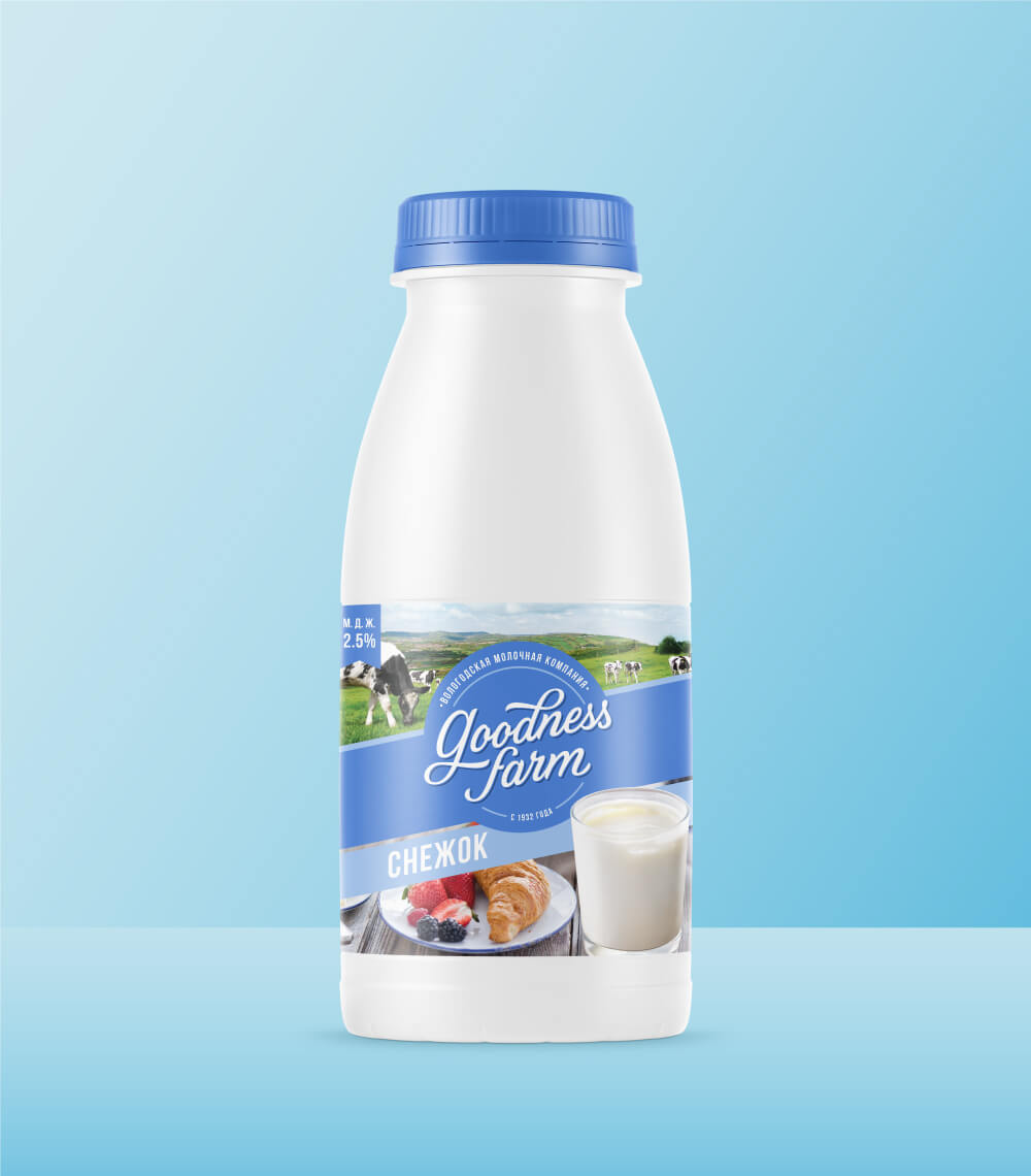
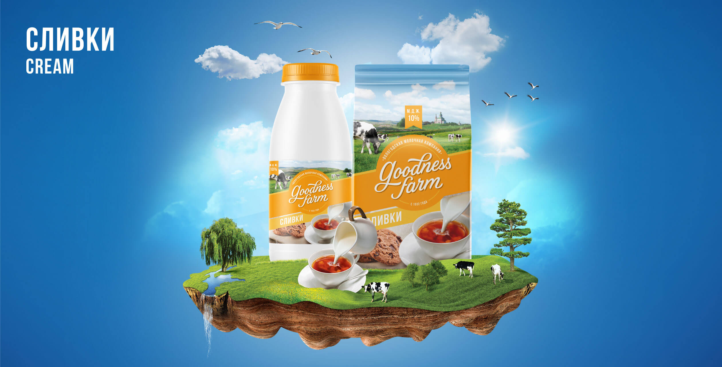
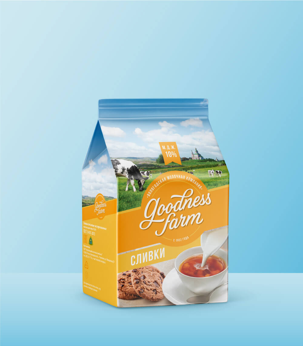
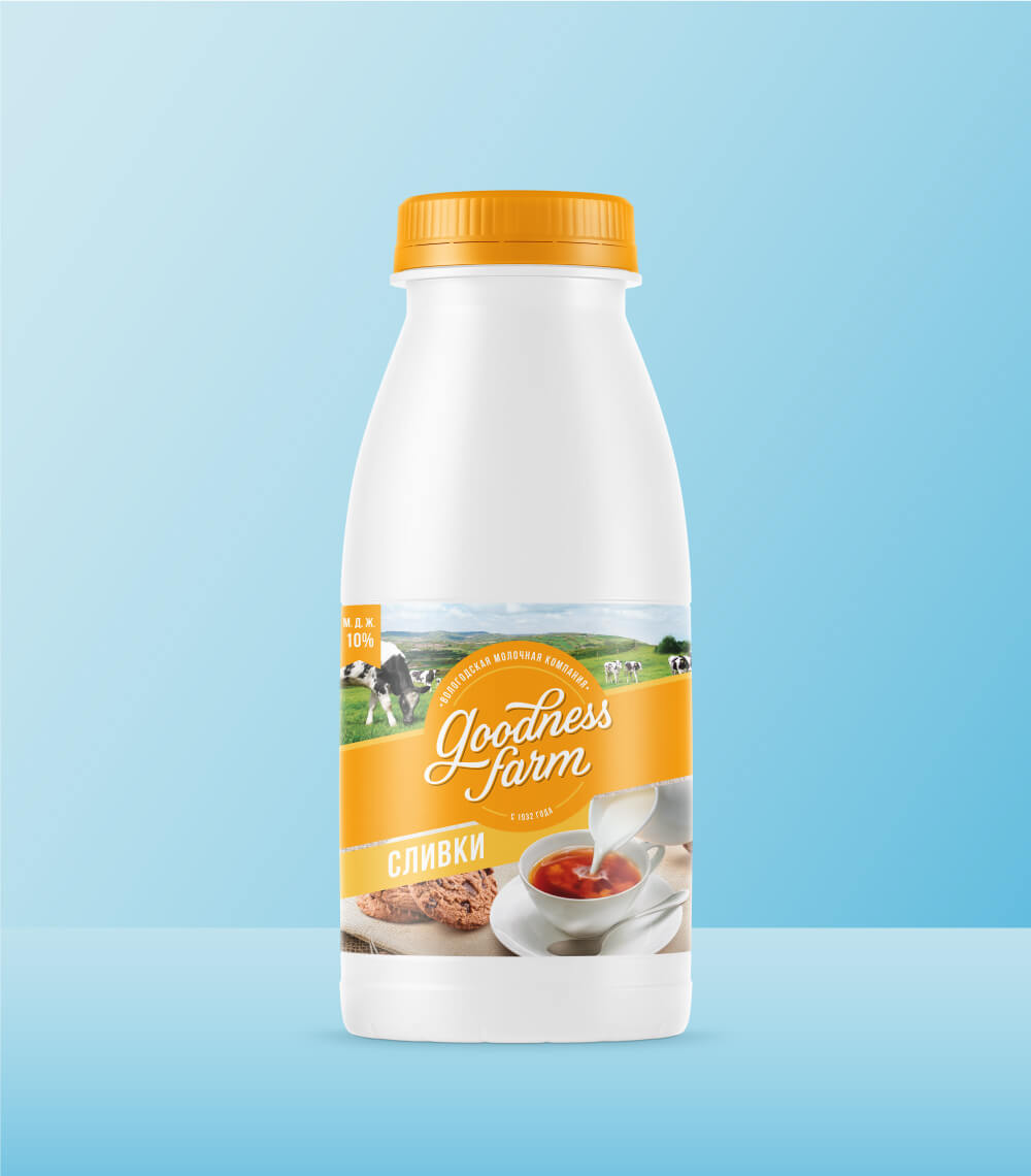
We wanted to capture everything the brand stands for in todays modern context but without loosing its roots. The logo unit has- Cherepovets Dairy Plant’s – Goodness Farm. Since 1932. Formed in a circular shape to look like a quality seal with bands around that one would imagine to break open with every pack. It also serves both as a good divider and brings together the region and Russian home tabletops with our products. Making the design architecture distinct & bringing all the products under one umbrella to let the value of each drive back to the mother brand.
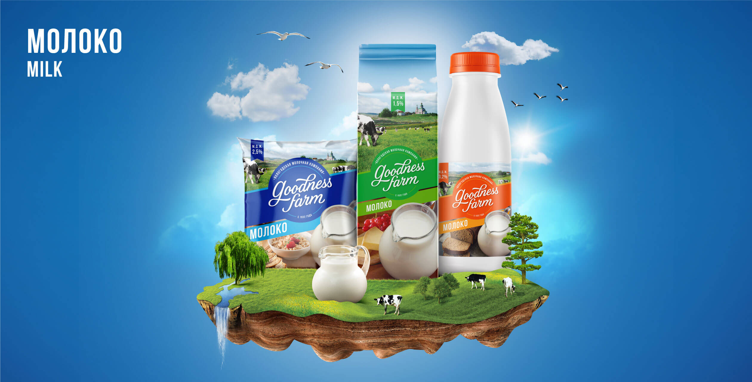
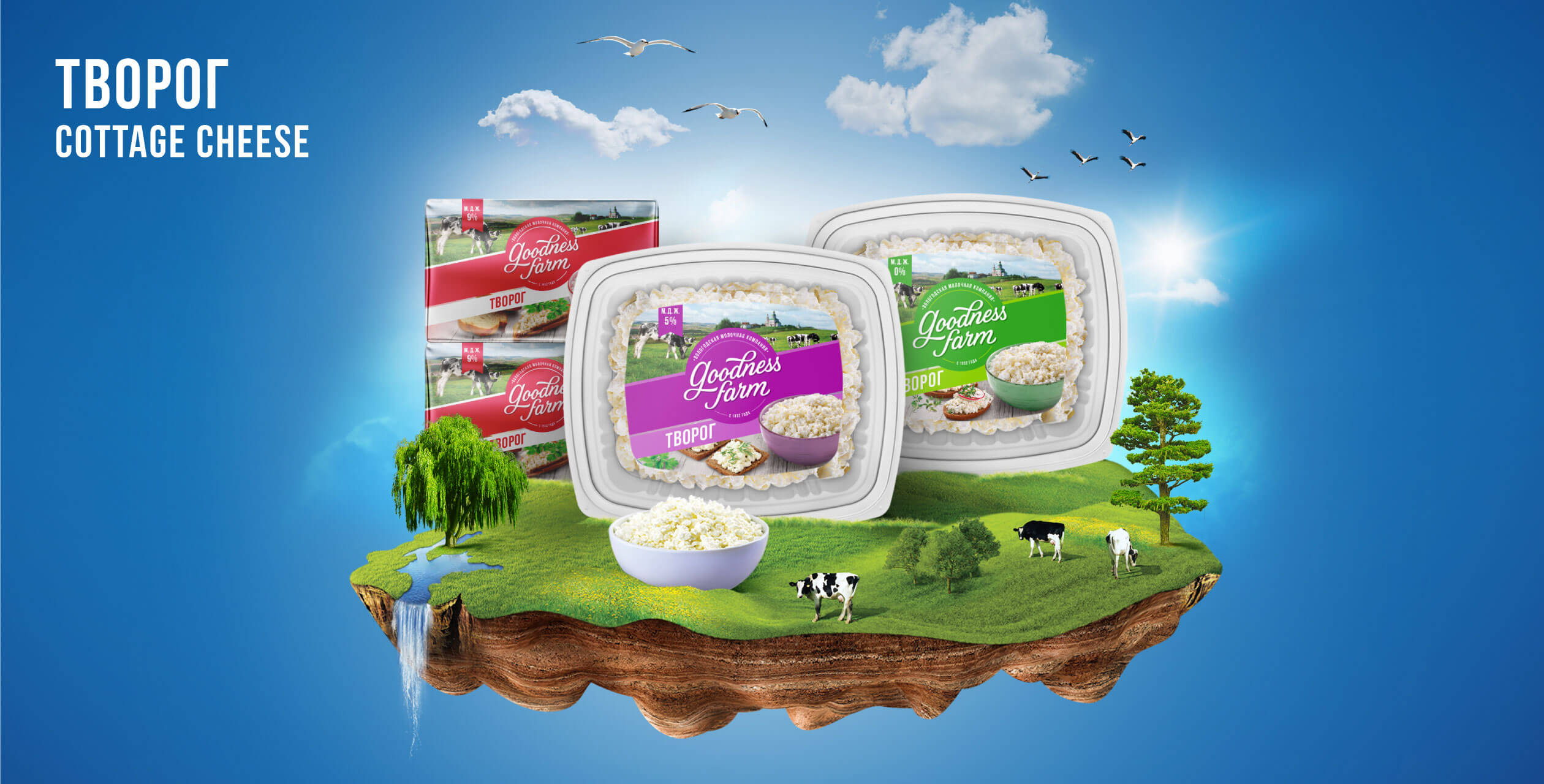
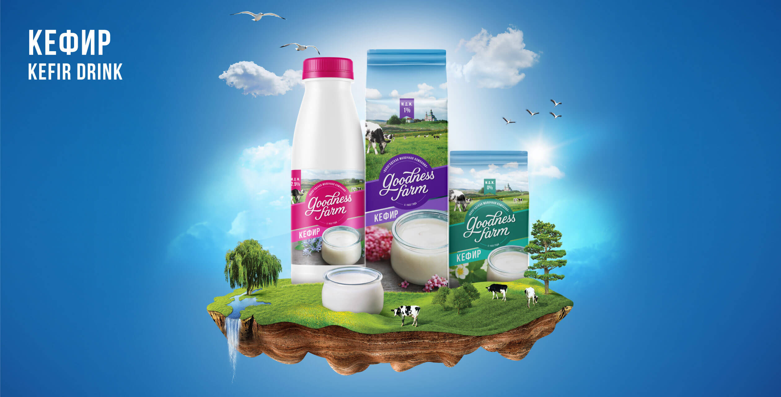
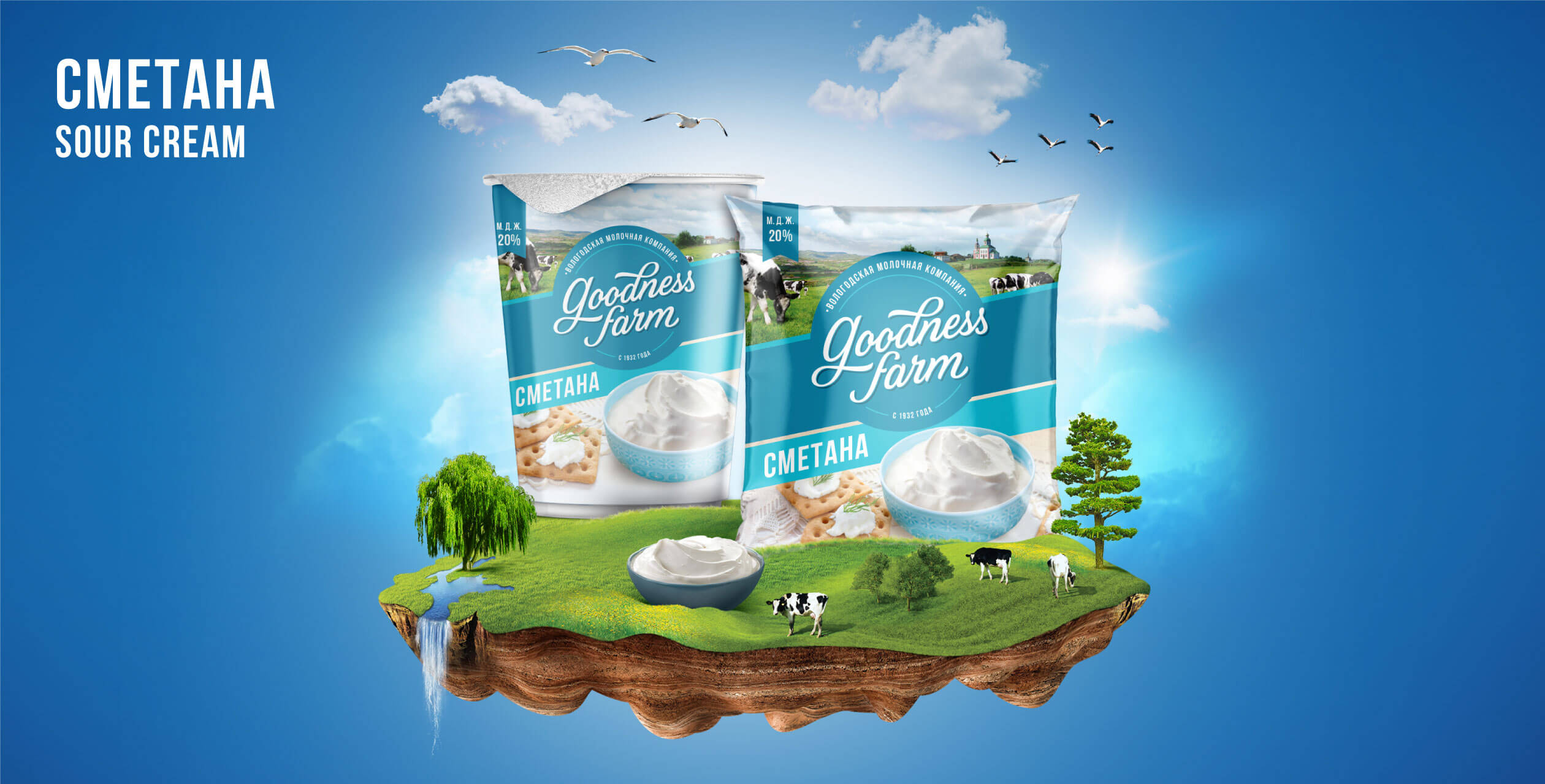
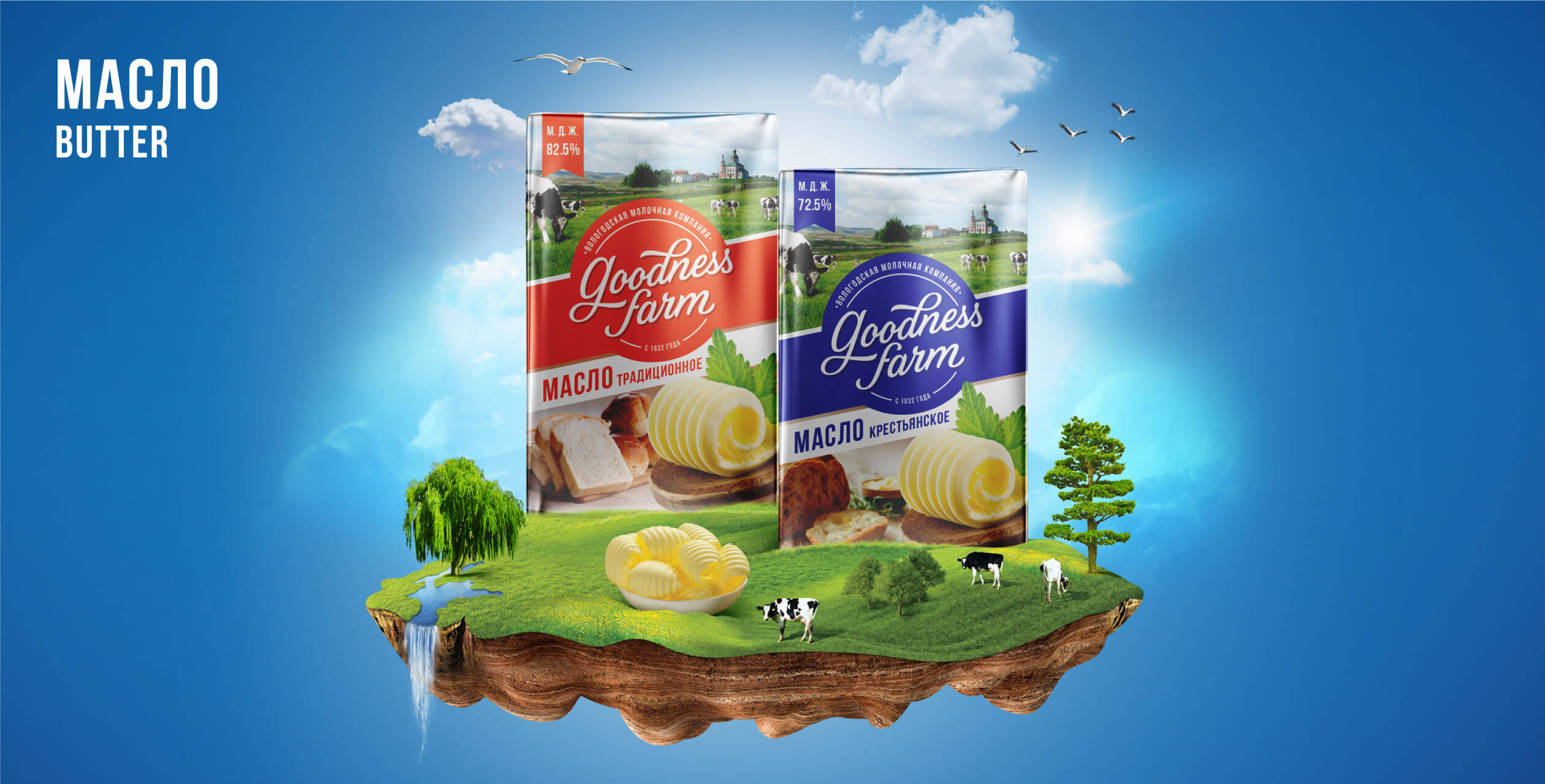
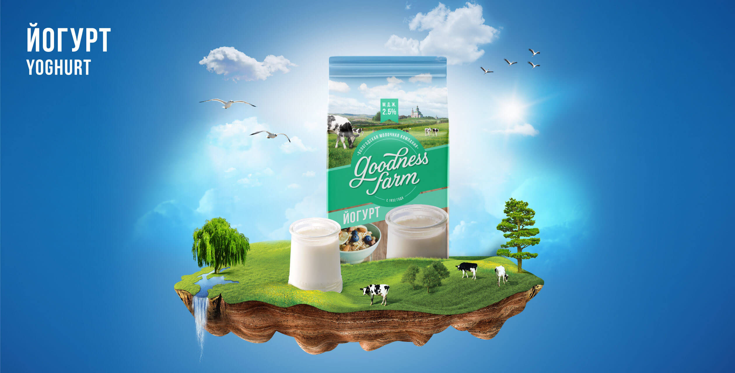
We also designed the communication to bring out this idea of a magical land called ‘Goodness farm’ with visuals of a piece of Volga basin floating in the air.
Launched in 2016 and later being renamed in Russian language, the brand has won several awards for its quality. It’s been loved and accepted by consumers so well that, it was clearly good to be Goodness Farm.
- Expertise
- Brand Strategy
- Brand Name
- Brand Identity
- Brand Tagline
- Packaging Design System
- Visual Language
- Brand Launch Communication


