Aquaclear - PepsiCo + RJ Corp Africa
Bringing crystal clear clarity, in water & minds for the launch of a new packaged water brand from Pepsi.
Africa based SALL (Sameer Agriculture & Lifestock Ltd) in collaboration with Pepsi Africa wished to launch a new brand of packaged drinking water in the African markets of Zambia and Kenya. We were appointed for brand strategy, branding, packaging, and brand communication duties.
How does a new brand get market and mind share from well established big brands who had cornered the competitive packaged water market in Kenya & Zambia?
Aquaclear drinking water was the benchmark of purity with their 5-step state-of-the-art treatment process, where they filter water with sand filtration, carbon filtration, RO, UV treatment, and Ozonation ensuring safety and freshness in every sip. While purity was definitely a winning physical attribute of product, it was also such a generic benefit to the category that unless we owned purity in a unique way, we could not build a long term, differentiated brand.
While most of the competition spoke of the physical aspect of water, no one spoke of the psychological & emotional benefits of water, we saw that as an opportunity.
Packaged drinking water was the norm in Zambia and Kenya and naturally, big brands had cornered the market. Our first step to differentiate and establish Aquaclear, was an extensive qualitative consumer research in the African markets, in which, ‘success’ stood out as the one thing the youth of Africa desired the most in their lives.
We dimensionalized purity to own an aspect of purity marrying it with this socio-cultural insight of Kenya. Success in anything we do requires confidence, focus, energy and vitality.
Now 70% of the human body is water, and up to 80% of human brain tissue is also water.
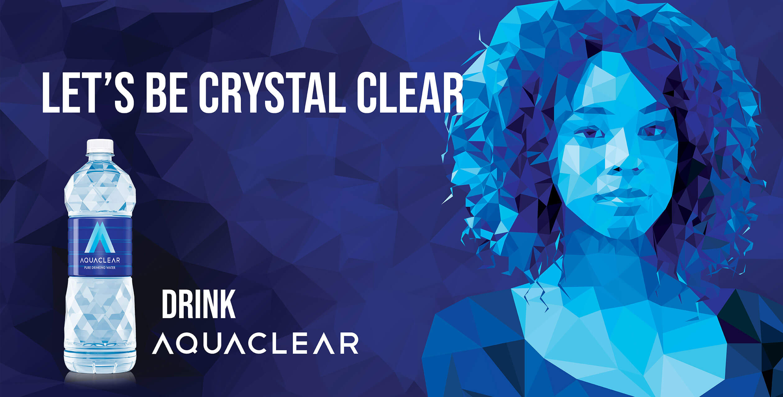
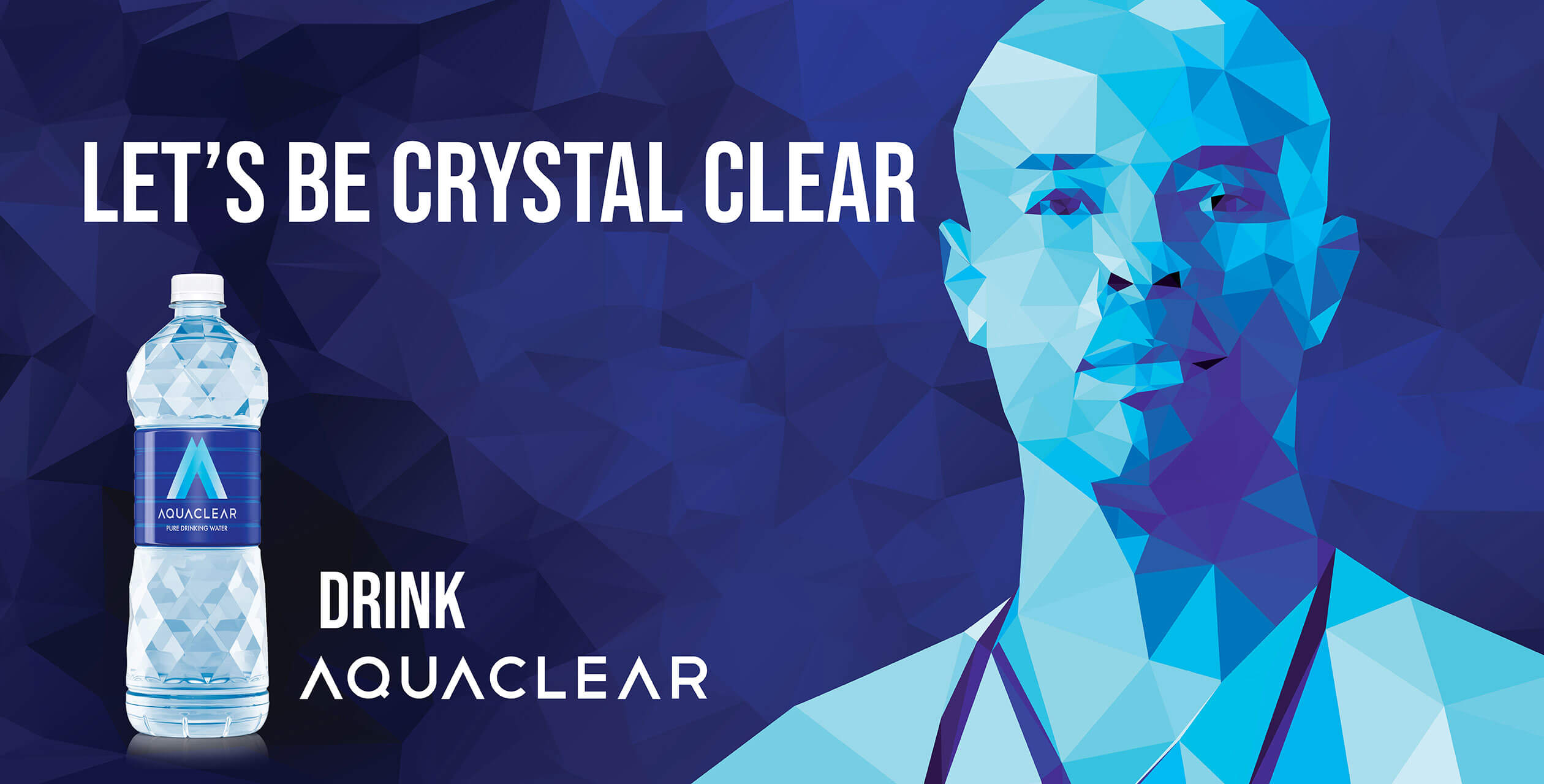
Which means, be it mental focus and clarity or physical vitality and drive, a large part of it is down to the purity & clarity of water we drink. Thus we set the brand premise in mental and physical clarity, using a ‘Crystal’ visual devise. To succeed, you need to be Crystal Clear.
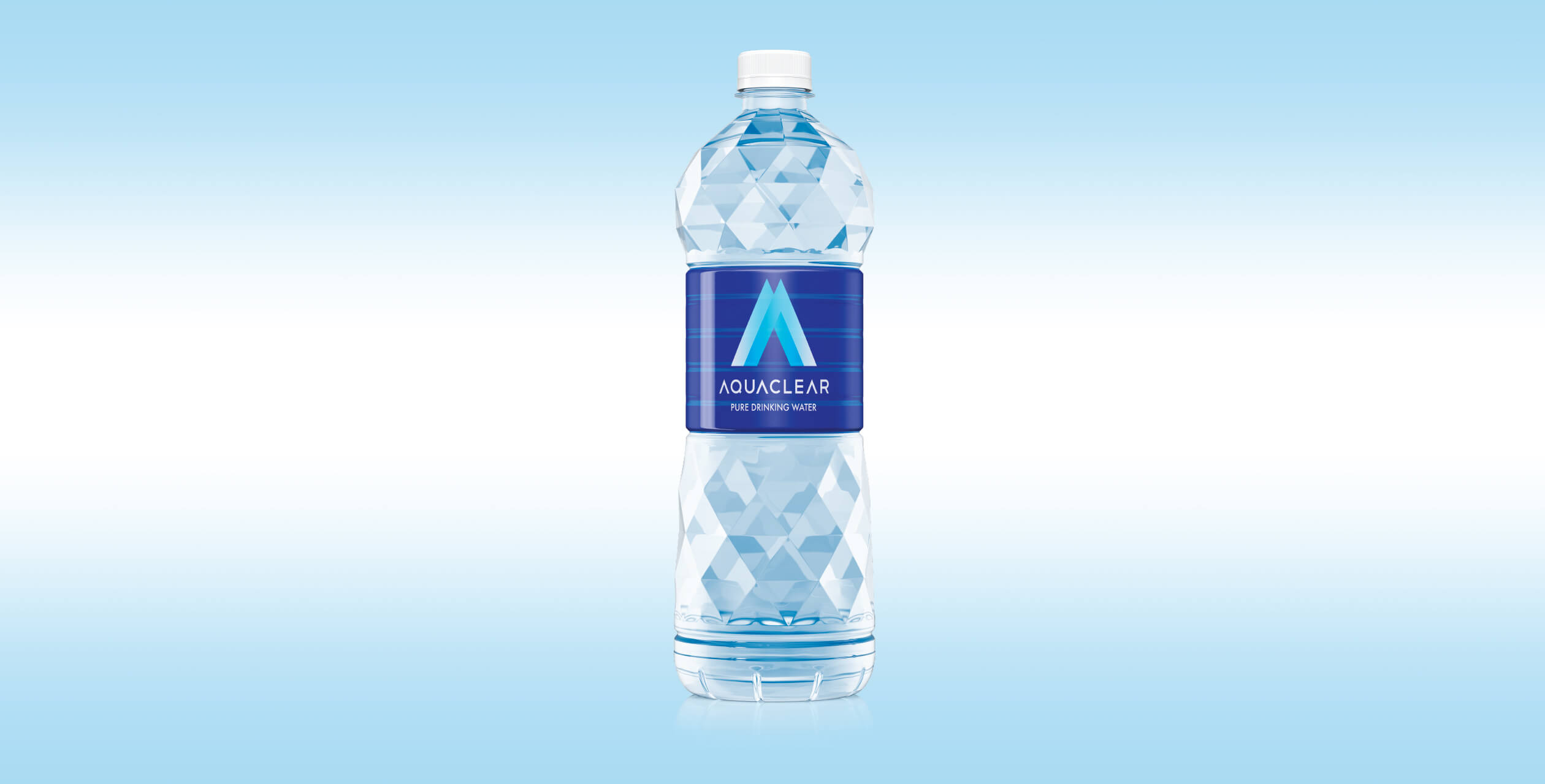
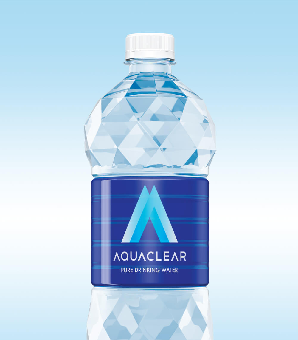
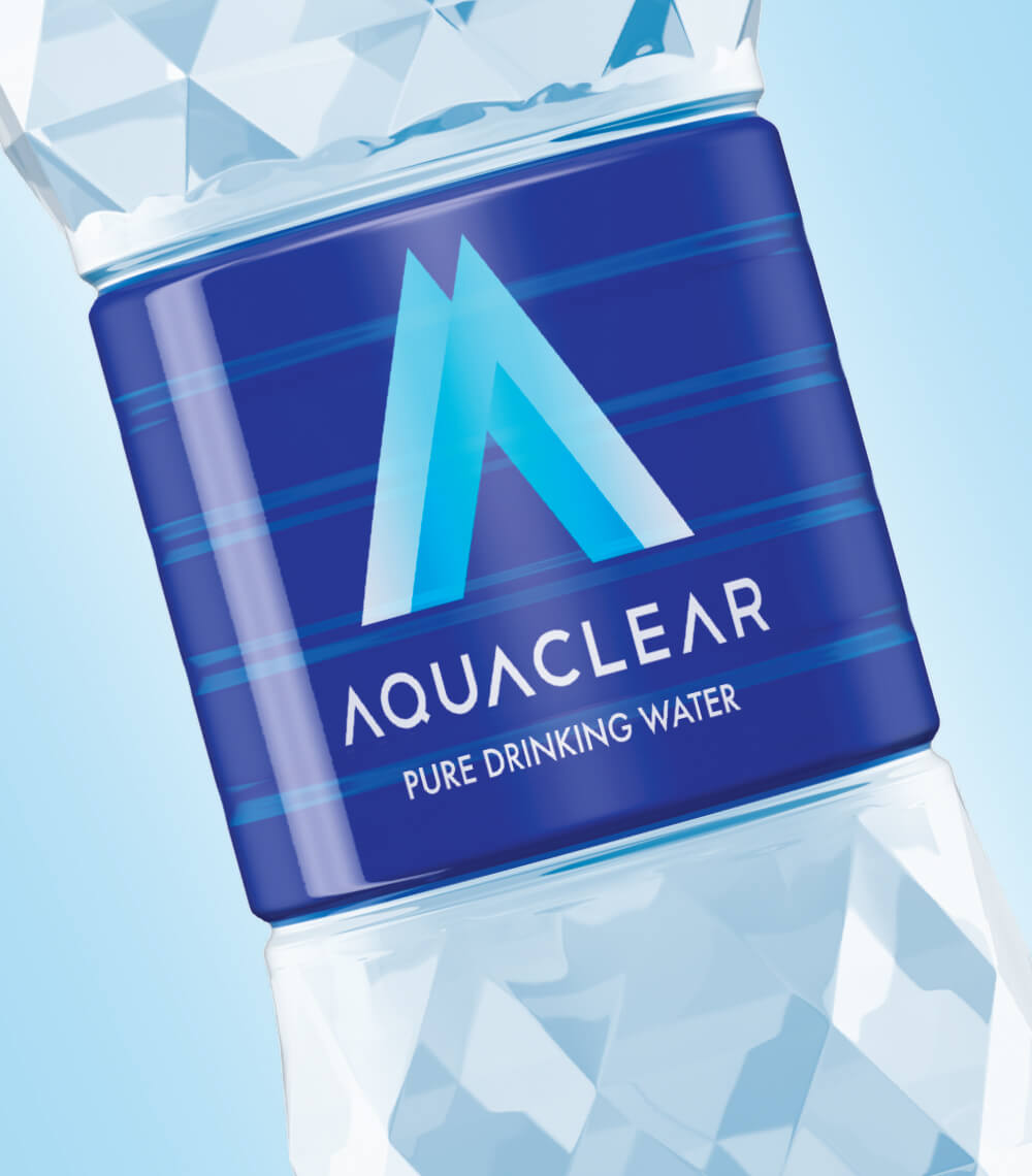
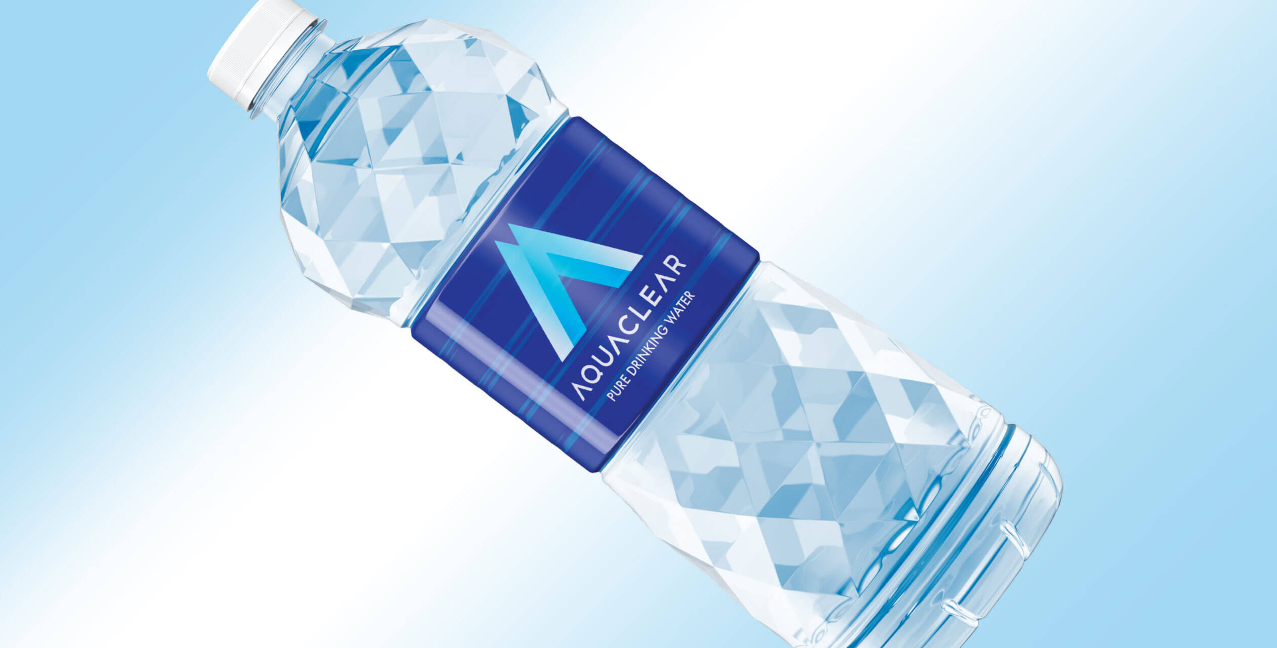
The ‘A’ from Aquaclear denoting crystal sharpness in thought and mountain peaks where the purest form of water comes from came together to form a distinct monogram. The shape also led to the packaging in crystal shaped clear bottle. Shades of blues were used to stay in the Pepsi brand colours. We created a distinct visual language for the brand inspired by the crystal triangular shapes, that stood out in the retail and outdoor space proliferated with real life images.
Since its launch, Aquaclear not only grabbed market share but also was voted as the most innovative brand of Zambia in the year 2013.
- Expertise
- Brand Strategy
- Brand Positioning
- Packaging
- Brand World
- Visual Identity System
- Brand Tagline
- Illustration
- Brand Communication

