GoDry
GoDry
Designing a universal language to speak in simple tongues.
VNC group, one the most trustworthy company in the south Indian steel sector, wanted to rebrand their waterproofing products to have a more focused positioning in the market.
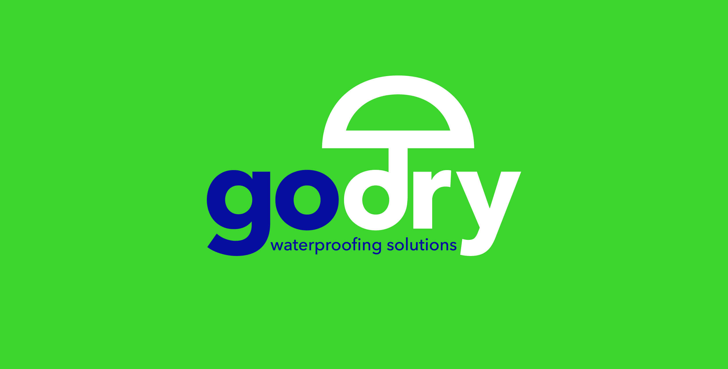
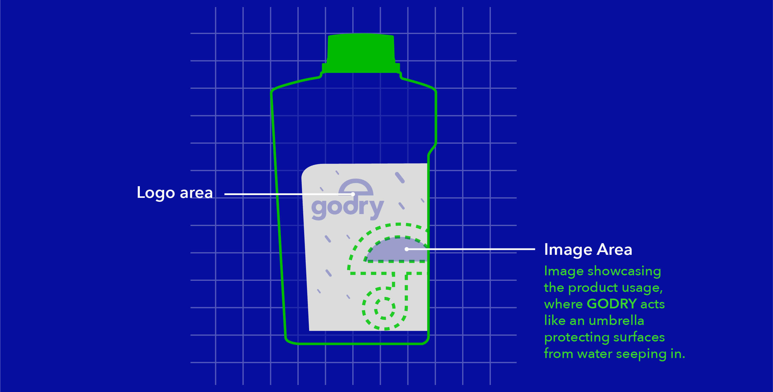
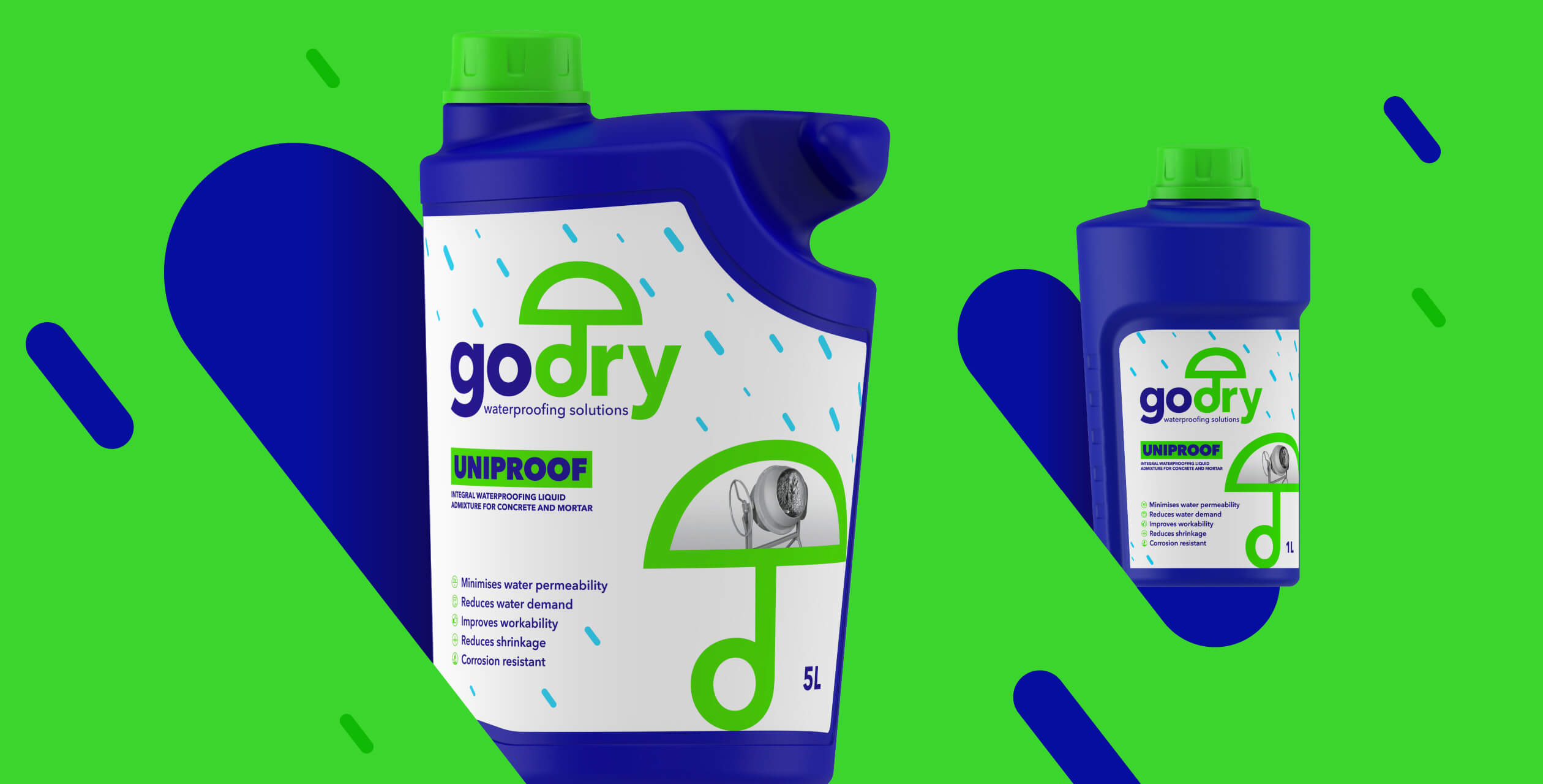
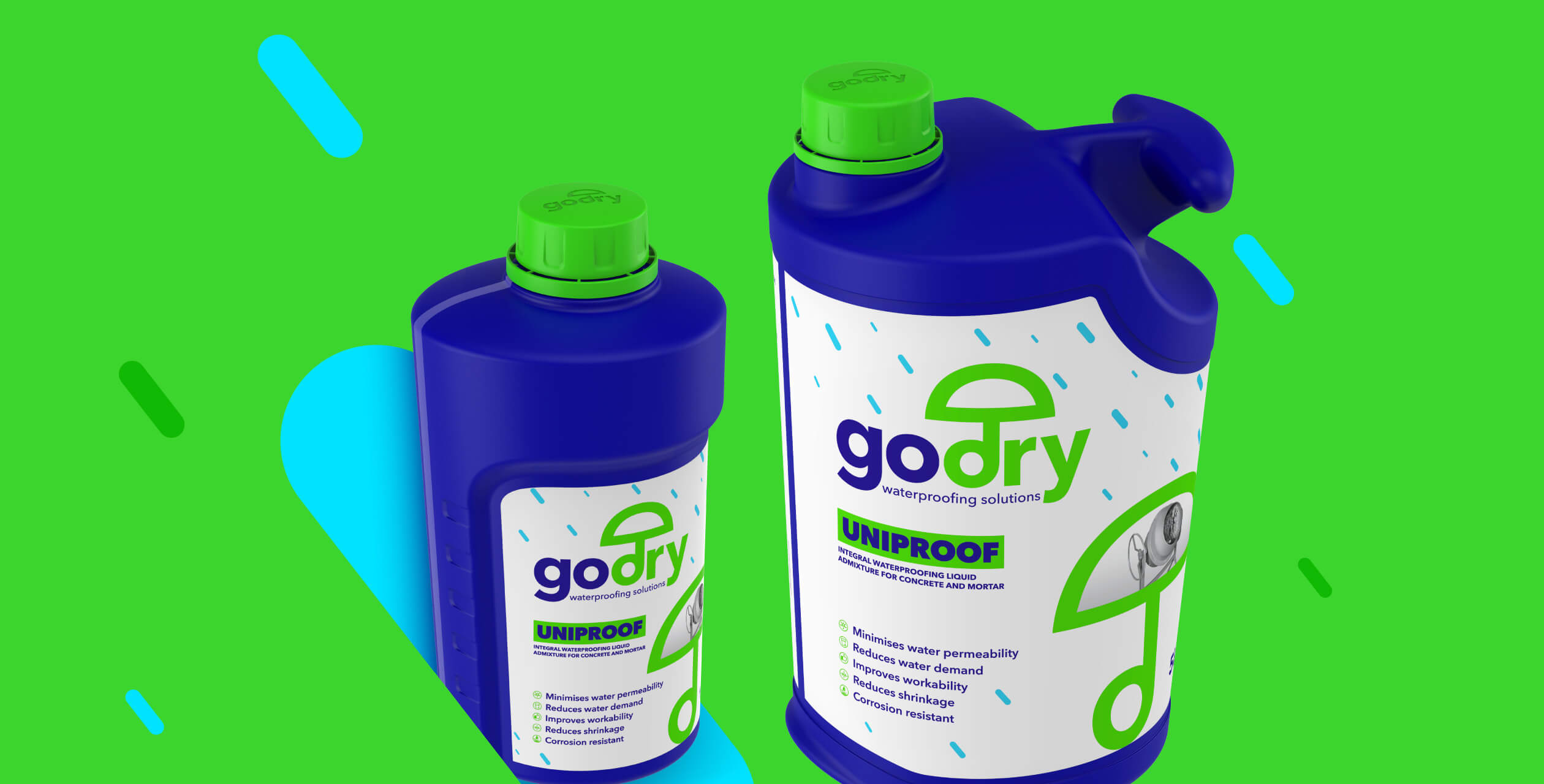
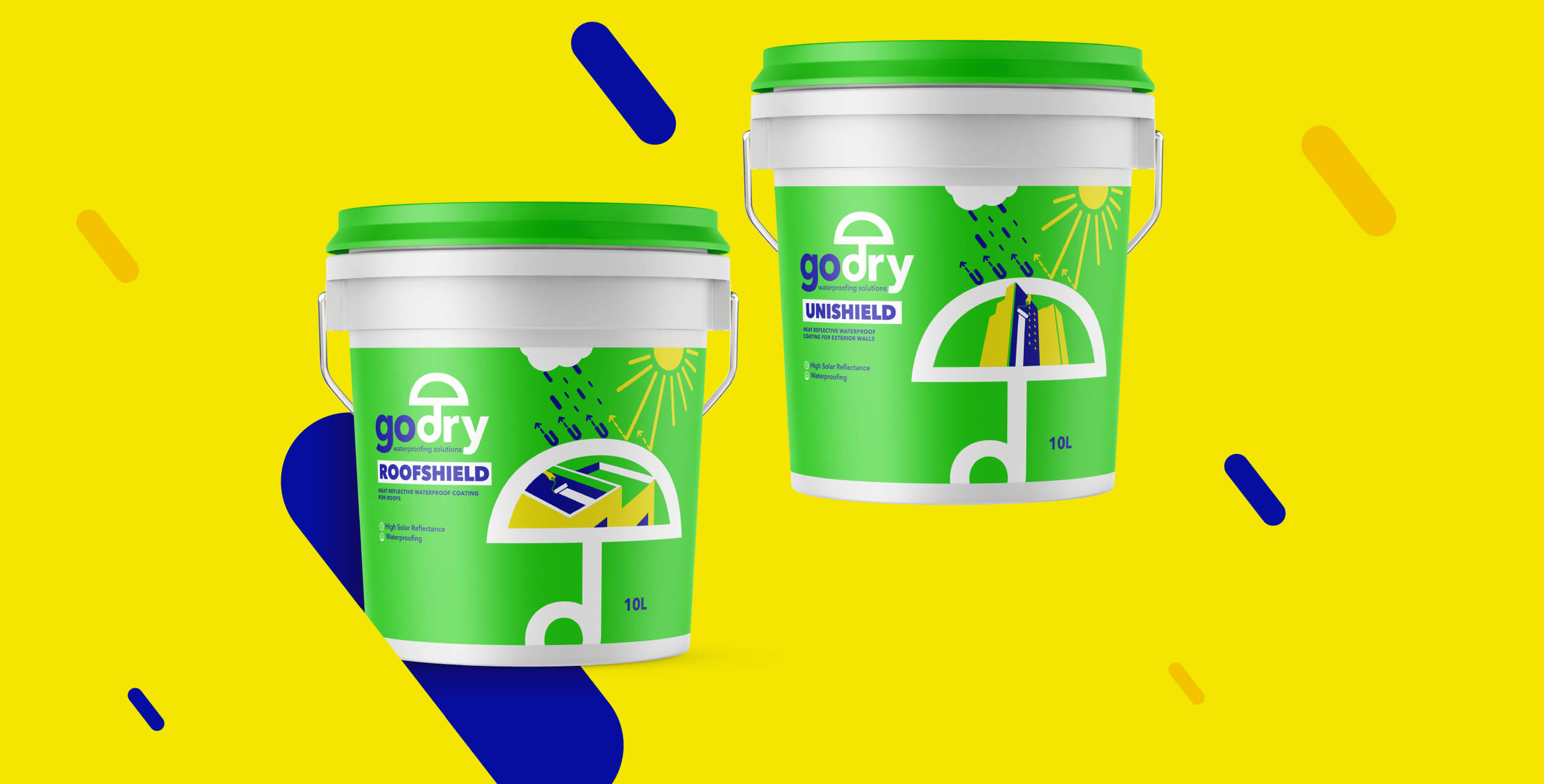
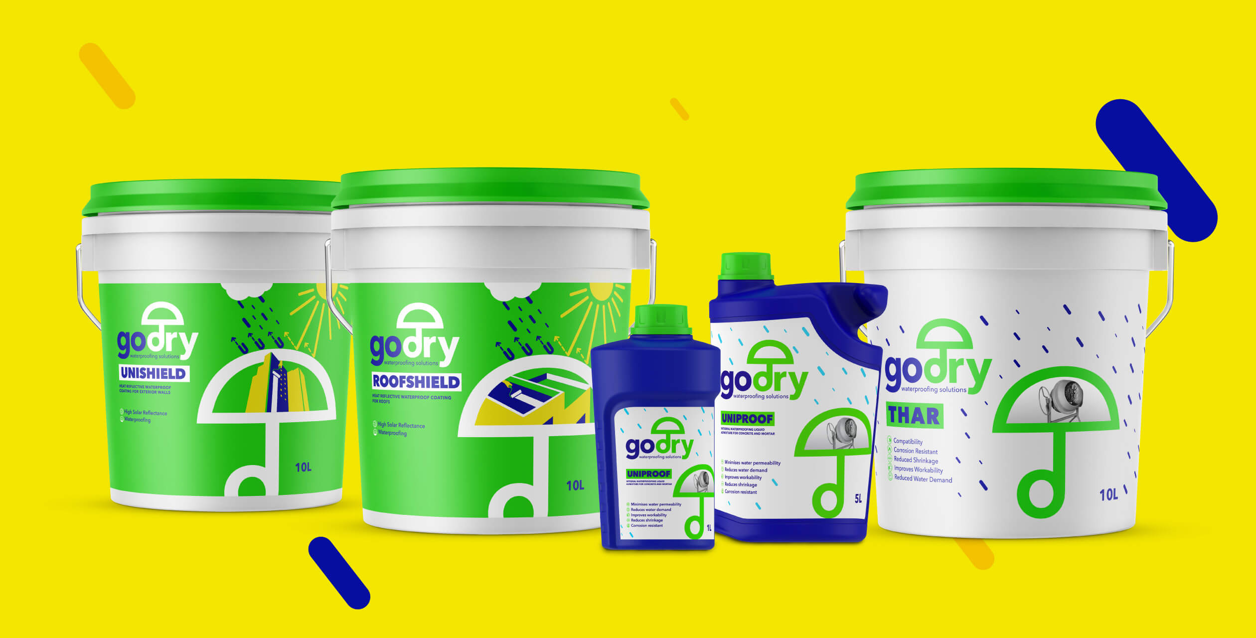
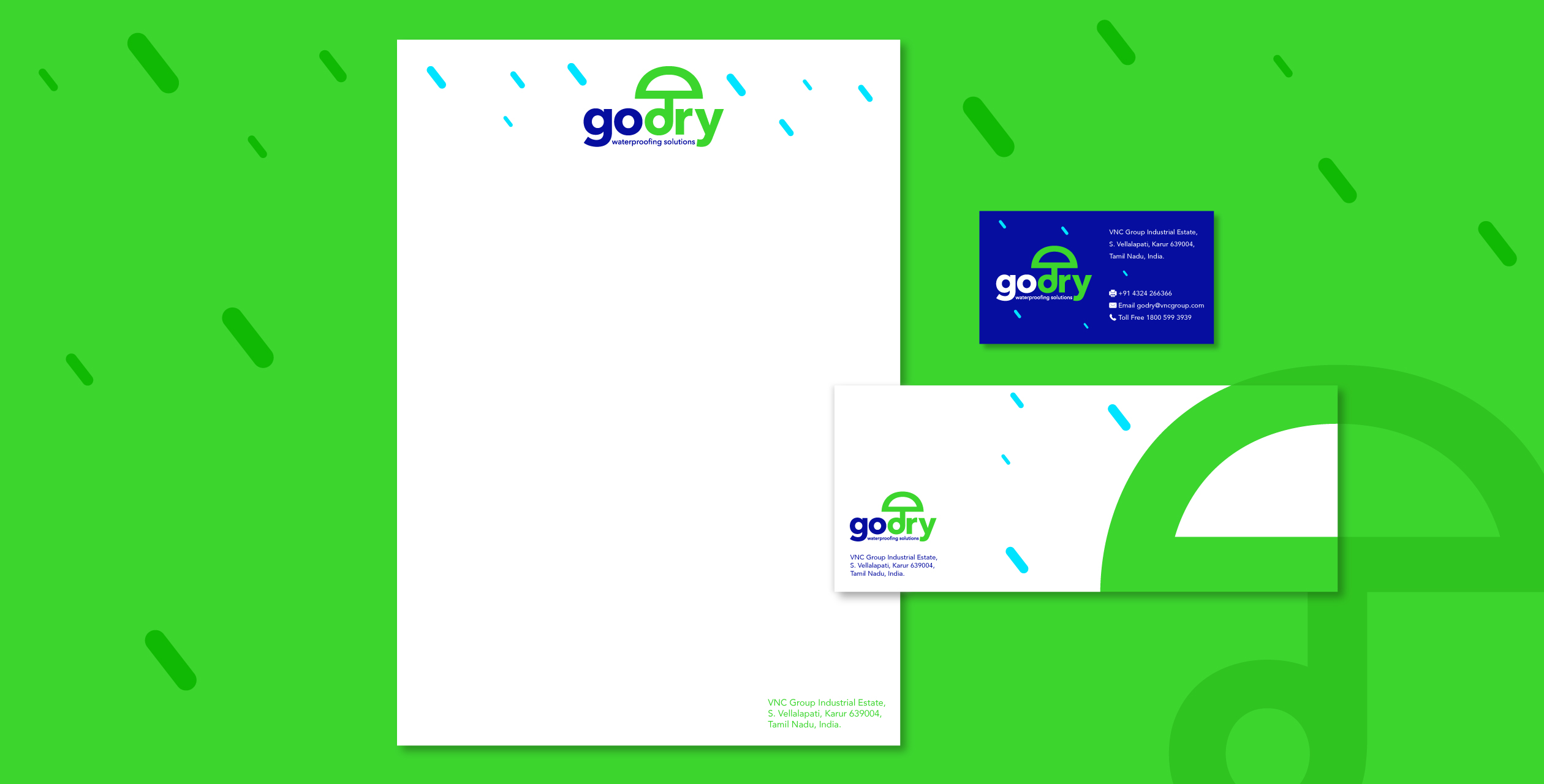
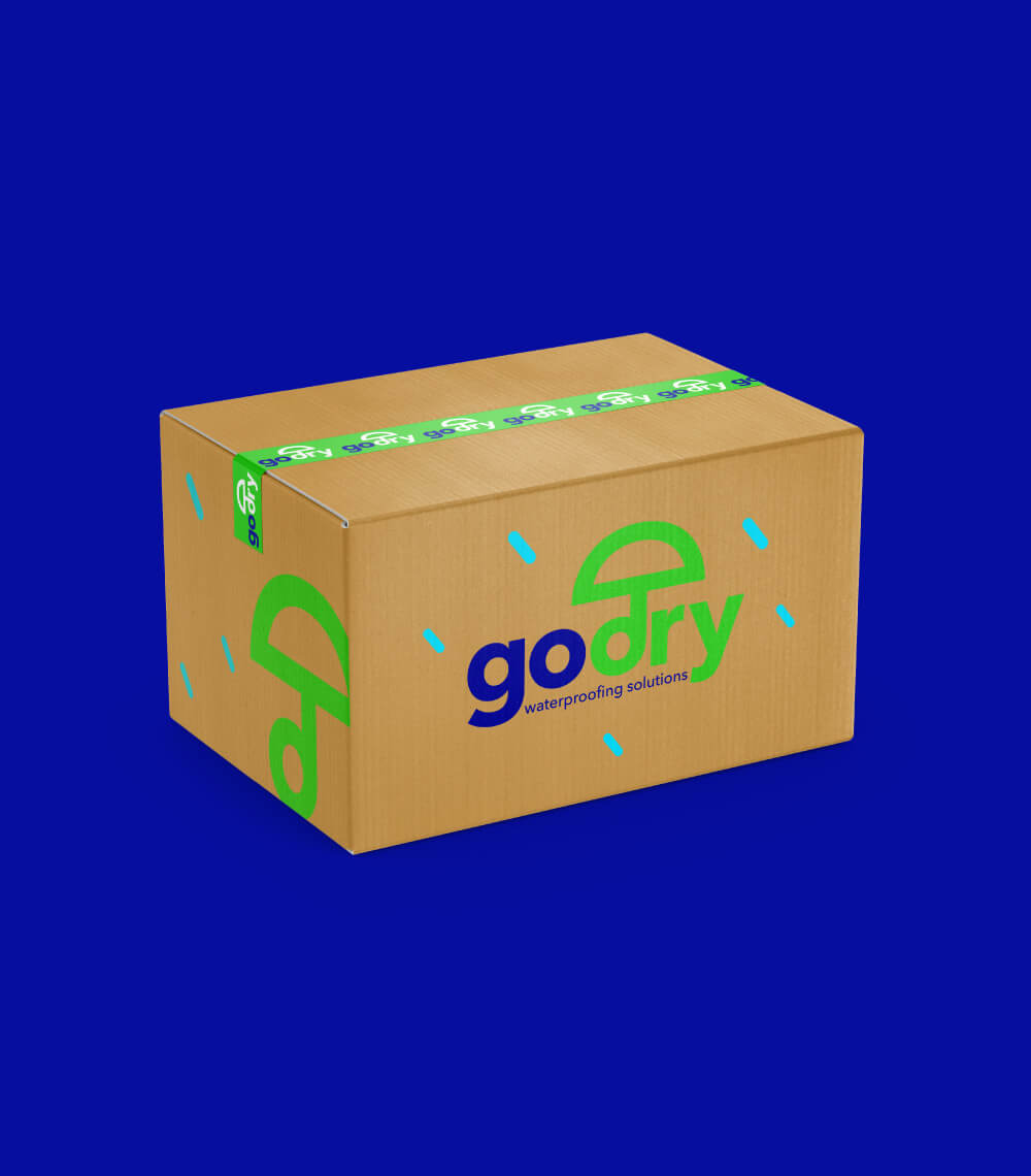
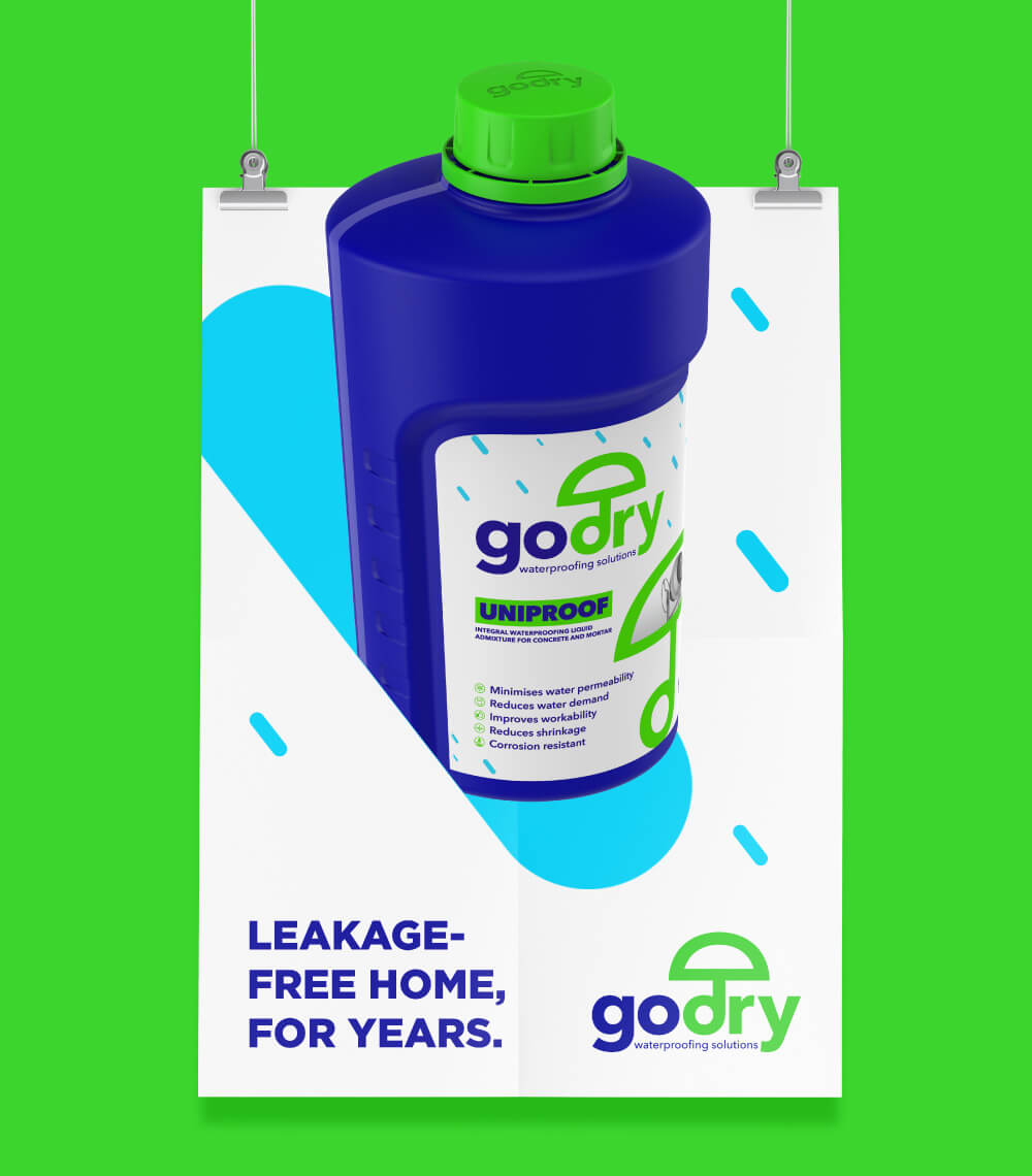
We combined these consumer benefits with what the mother brand stands for – trustworthy protection, and found an answer in the visual device of the humble umbrella, the most easily understood and universal symbol of protection against rain & sun.
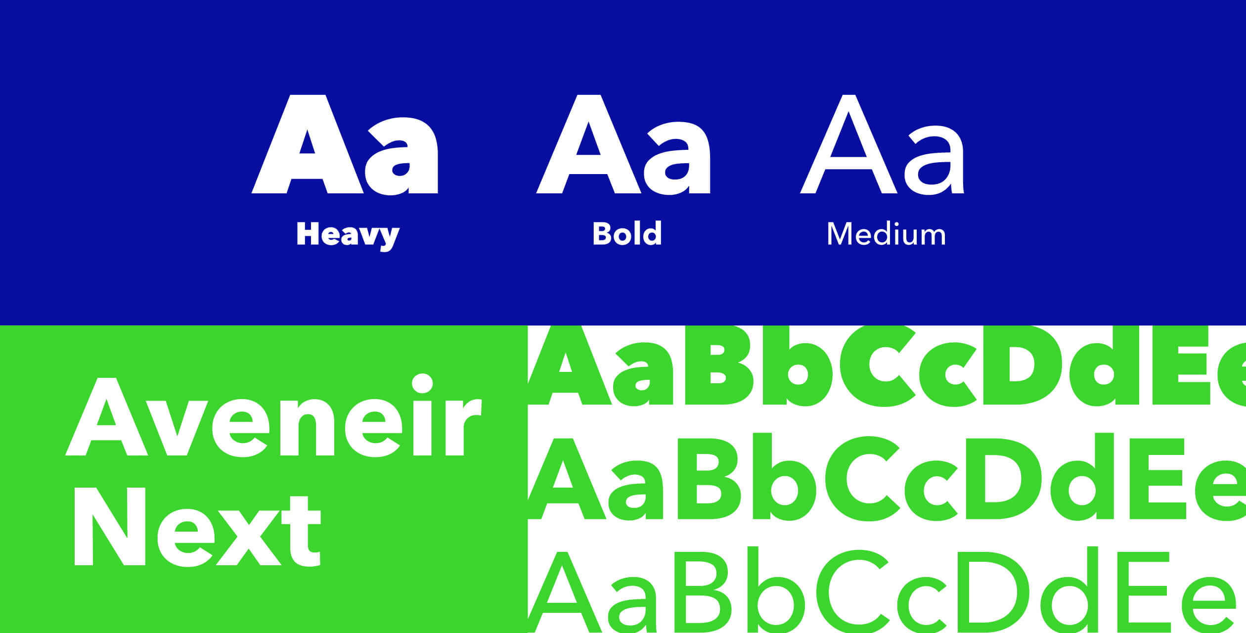
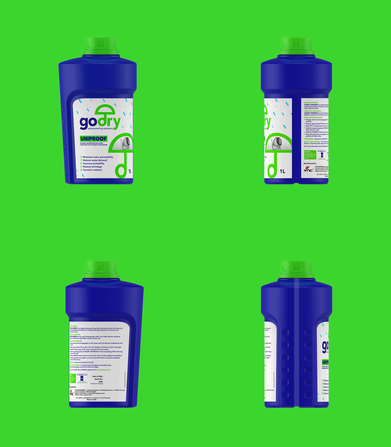
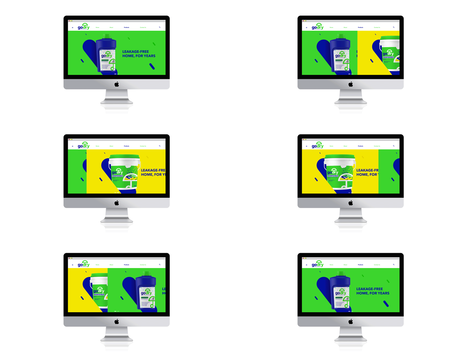
We kept the branding & packaging very graphic and bold in colour to stand out on the cluttered hardware store shelves & also to make it easily understood by even labourers and semi-skilled workers who often end up buying these products.
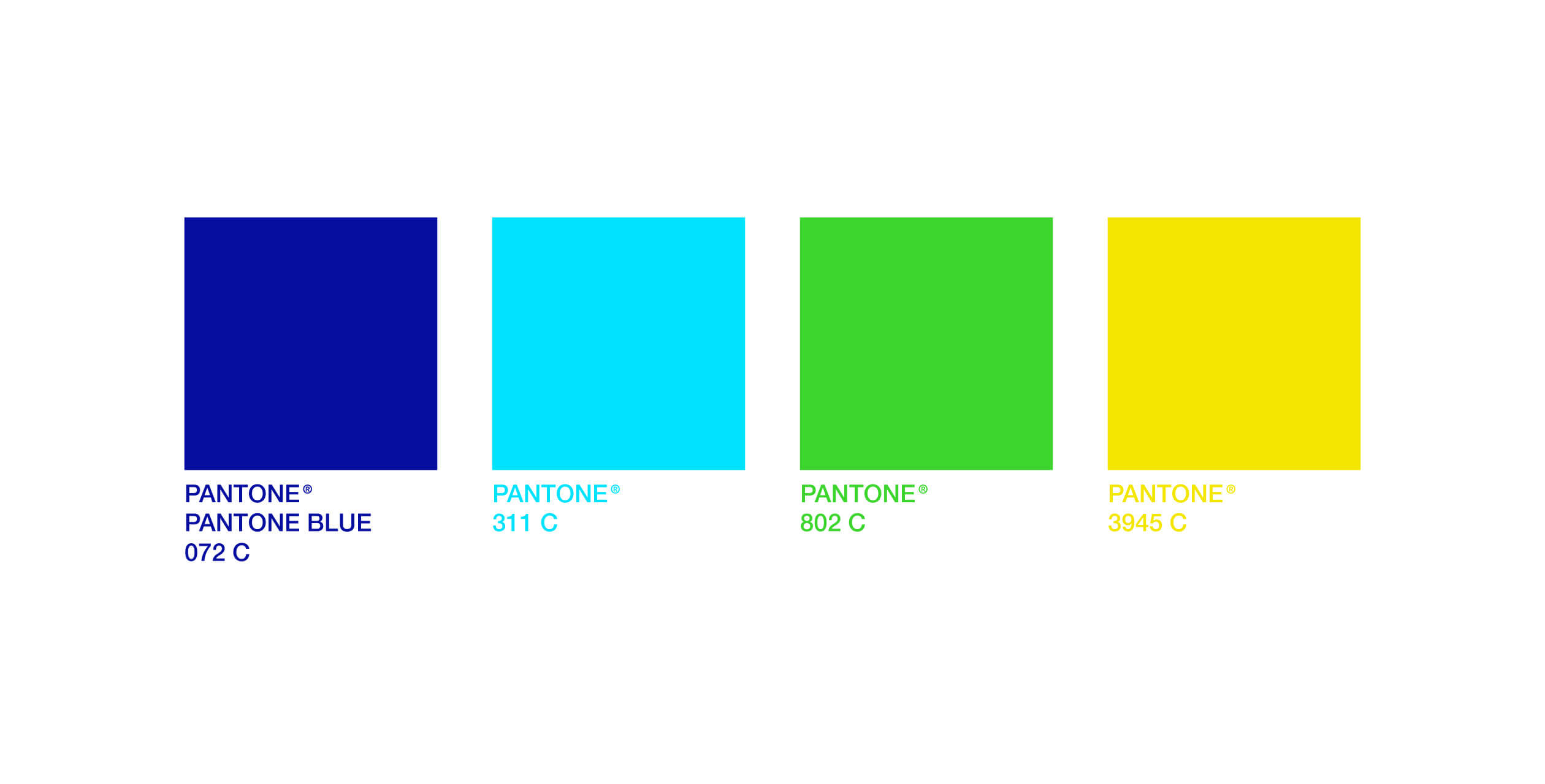
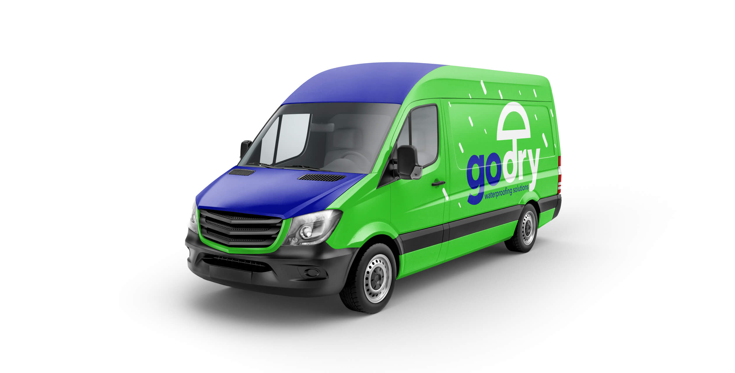
The colour blue was used to represent water & green for what it brings to the consumer – trouble free, healthy lifestyle.
The modern & bold packaging appealed equally to college educated & blue collared sections of society, re-establishing our faith in the universal language of design.
+ More Information
- Expertise
- Brand Identity
- Packaging Design
- System


